Where I've been
- HousebetsSenior Product Designer and Design Engineer
- BitpandaSenior Product Designer
- FloozLead Designer
- LifeWorks Wellbeing (Telus Health)Senior Product Designer
- IdeatoLifeUX/UI Designer
A kettlebell app for iOS that tells you what to do today, runs the session and moves the plan on from what you actually did.
 Tonzo
Kettlebell training is simple and most apps around it are not. I wanted one that says what to do today and starts it in one tap. Every rep is logged as load moved, so a session adds to a number that keeps growing: every 1,000 kg is a Tonne.
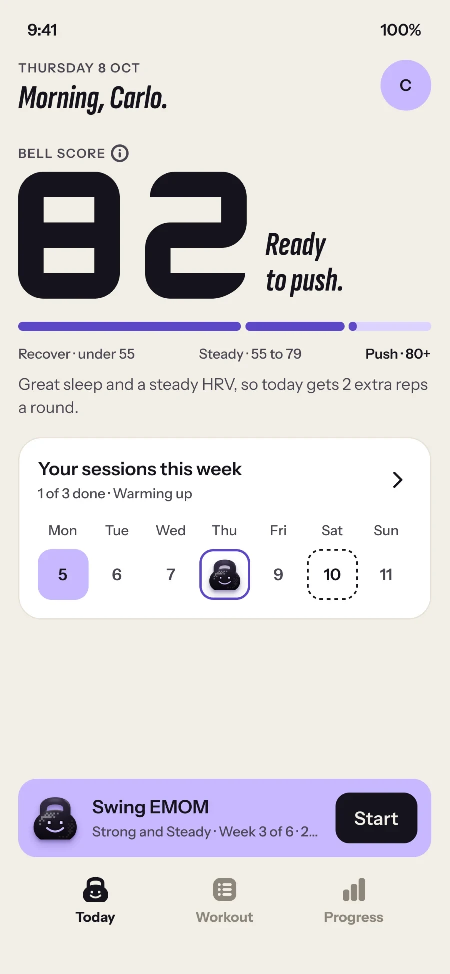
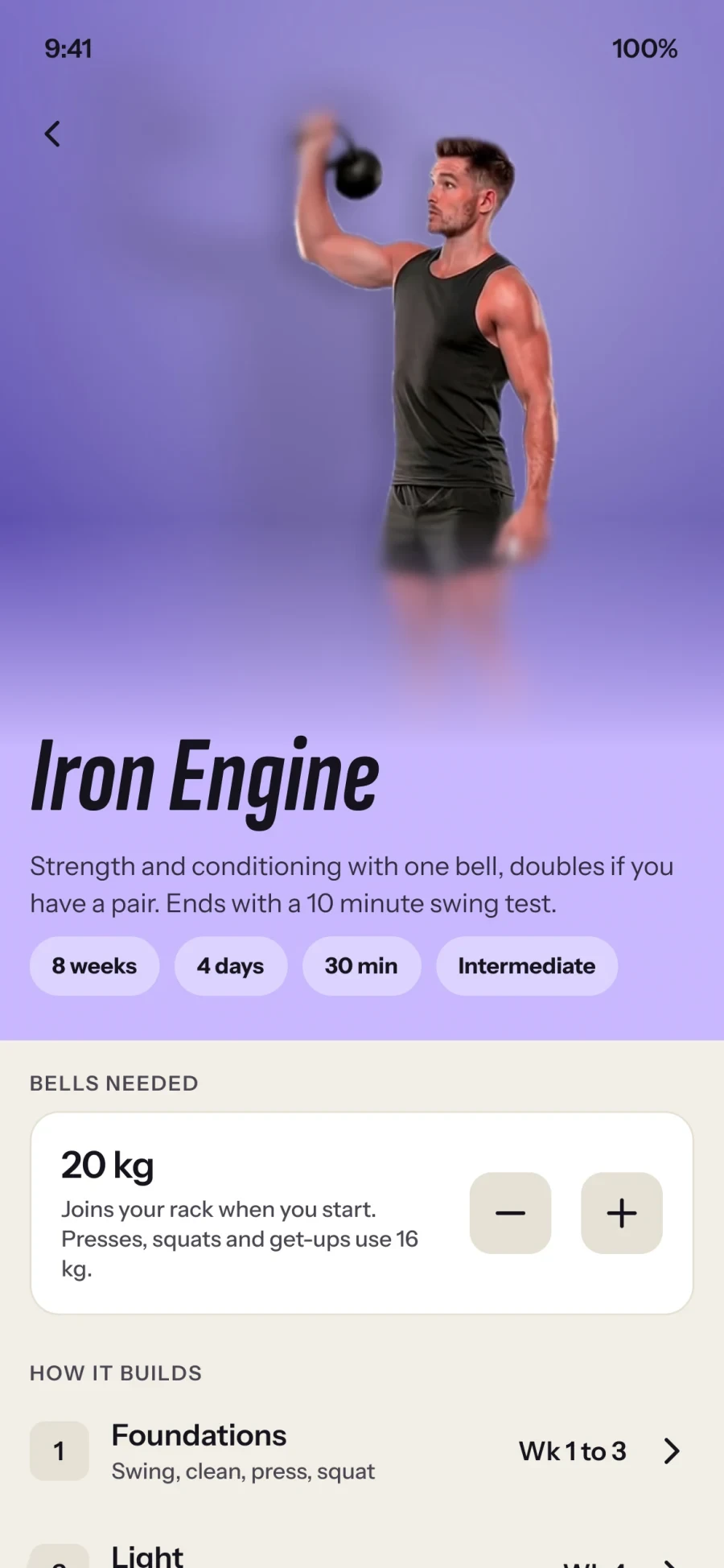
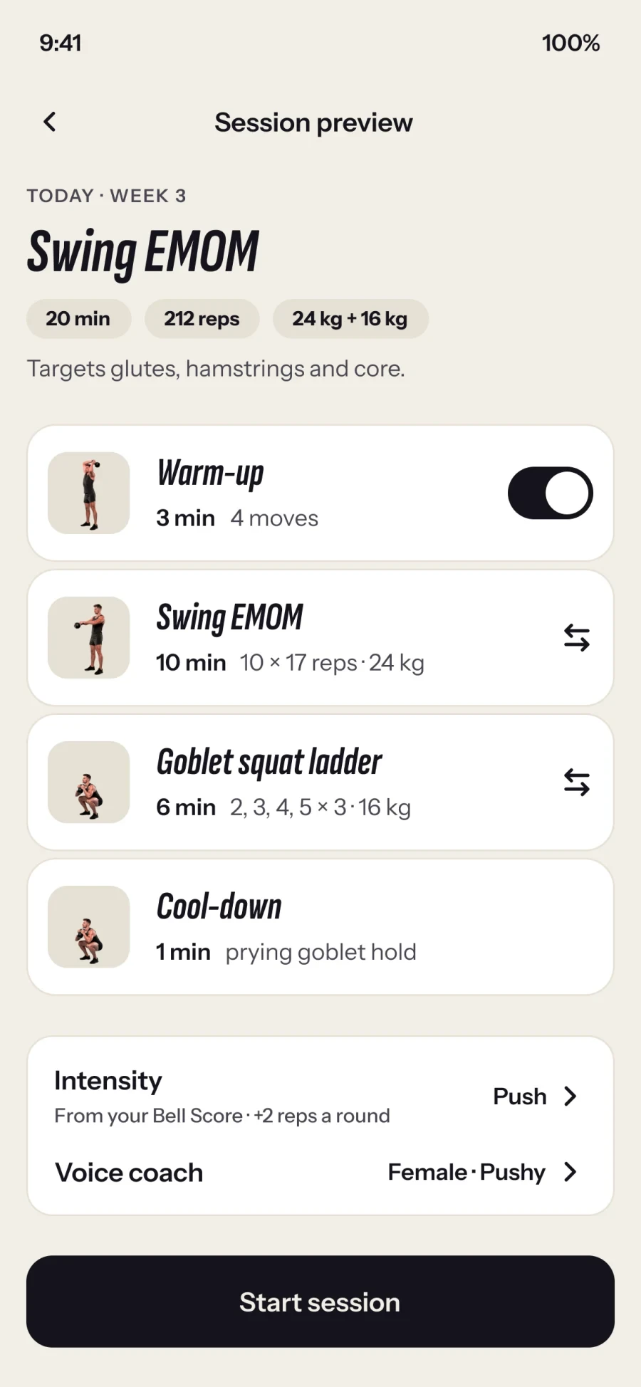
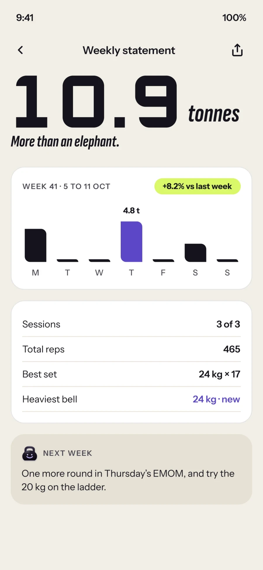
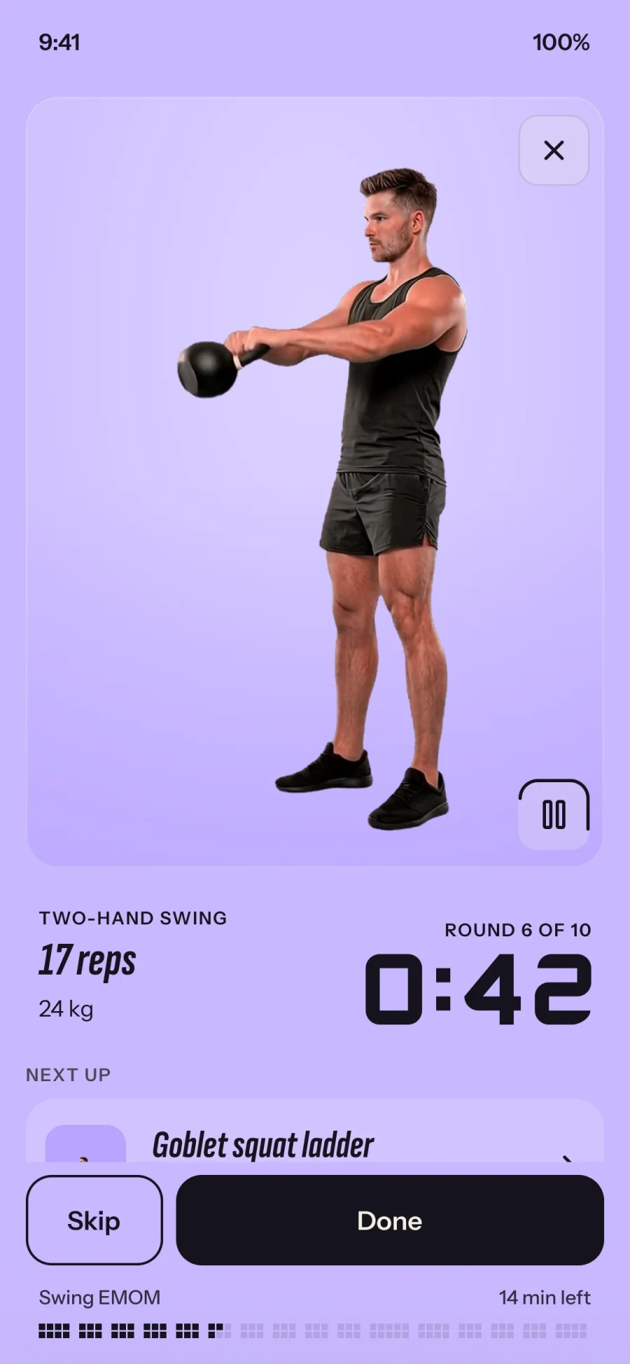
Mid-session the phone sits on the floor at arm's length, your hands are sweaty and your attention is on the bell. So the live screens use big digits, haptic beats, audio count-ins and a Live Activity, and every move has a demo clip you can read from a distance.
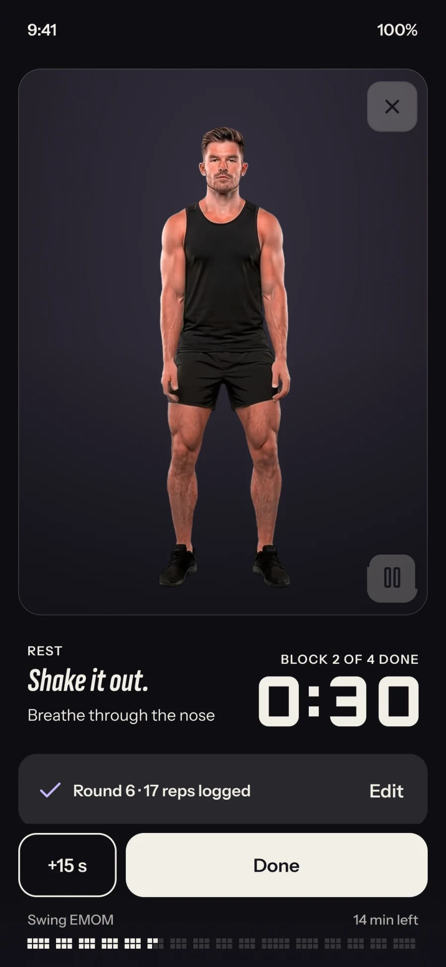
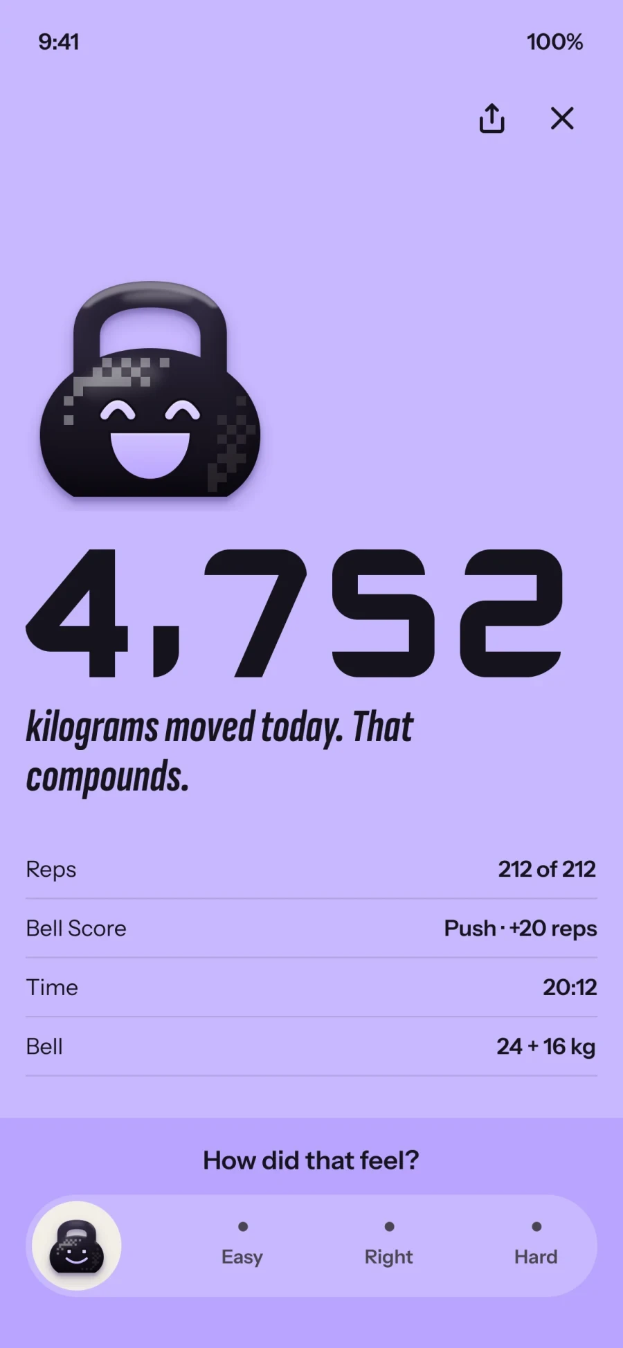
Real life gets in the way of training. Missed weeks, breaks and Easy or Hard ratings change the plan quietly instead of scolding you. Programs are hand-written and progress by rules a coach would sign. Nothing is generated.
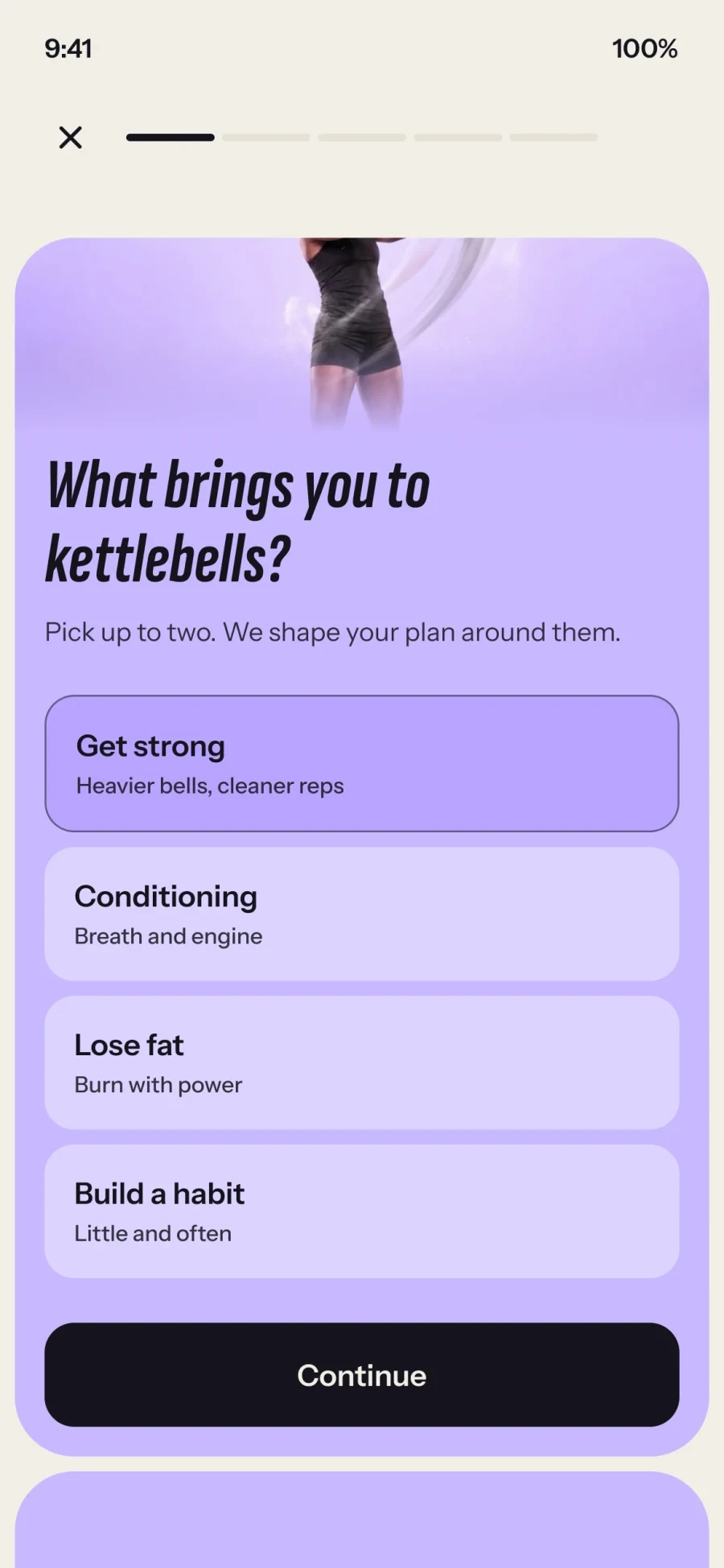
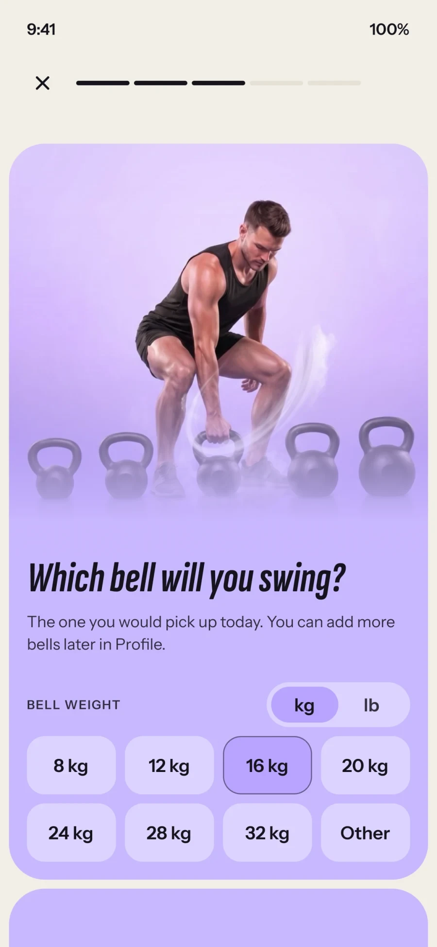
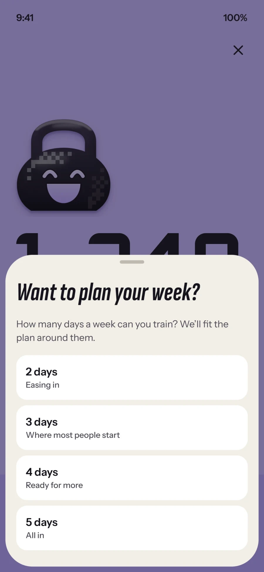
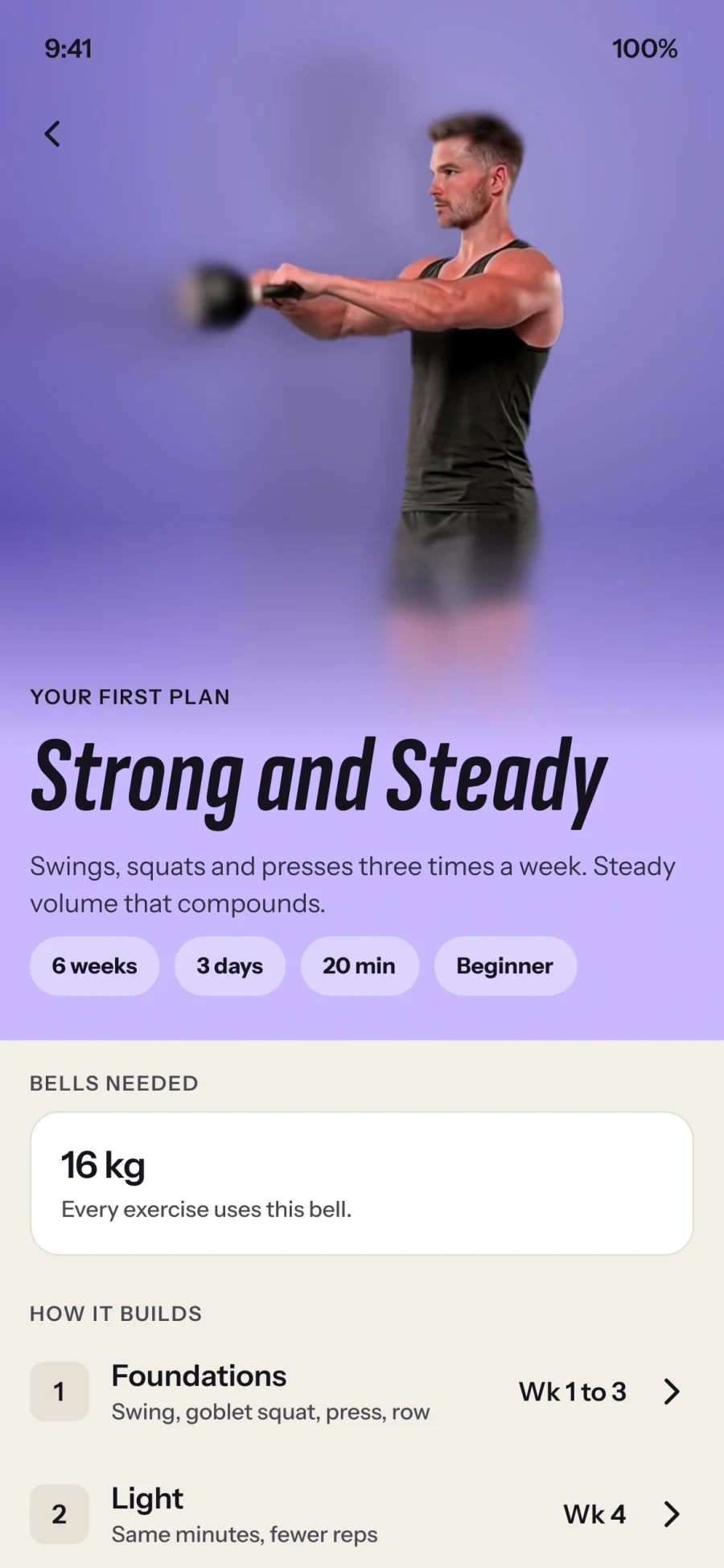
I designed the brand, the type and every screen in Figma, then built it myself in SwiftUI, with a UI test for every route. It's the clearest version yet of how I like to work: one person holding the idea from the first sketch to the phone in your hand.
Tonzo is in early testing and every feature is free for now. No numbers to share yet, and I'd rather wait for real ones, so the figures in these screens are sample data.
I designed and shipped experiences across Housebets, from the shared design system to everyday product flows.
 Housebets
An exploration of a refreshed visual identity across desktop and mobile. These screens show a proposed direction, not the current product.
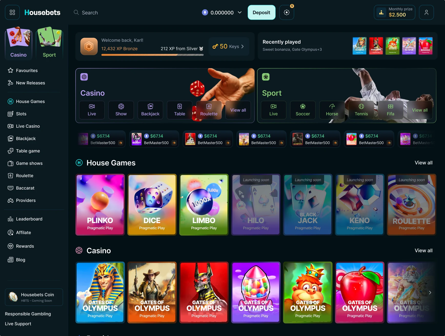
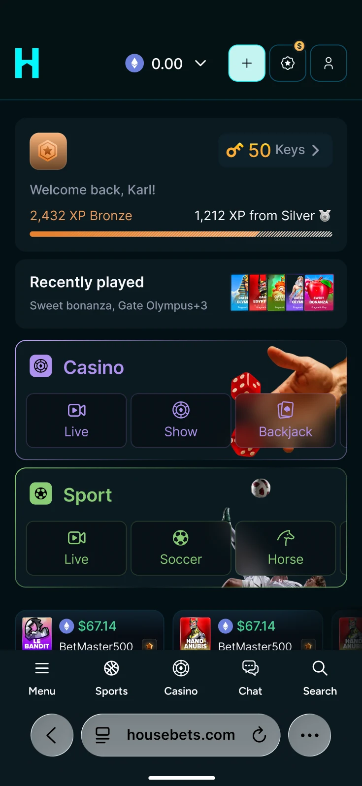
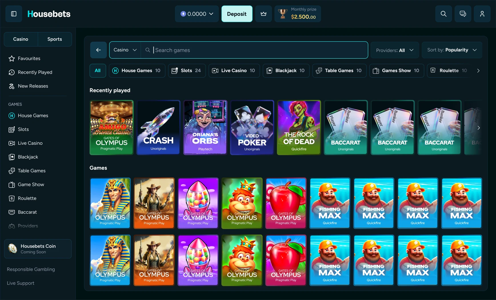
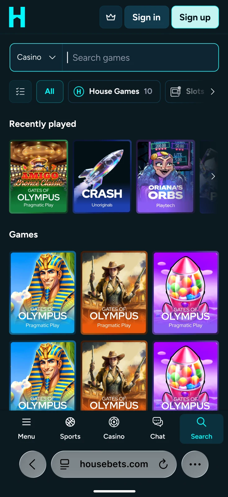
A connected search experience with clear filters, recent searches and layouts tailored to each device.
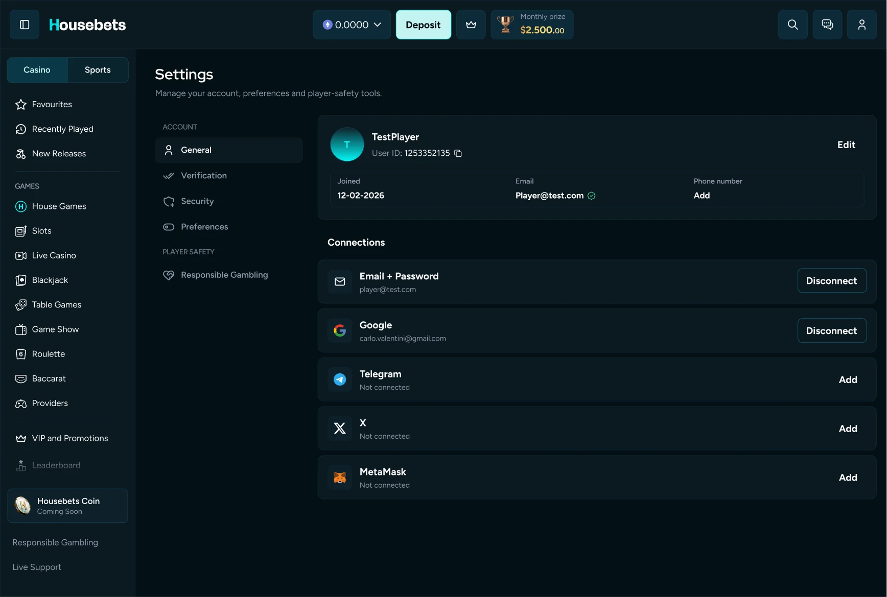
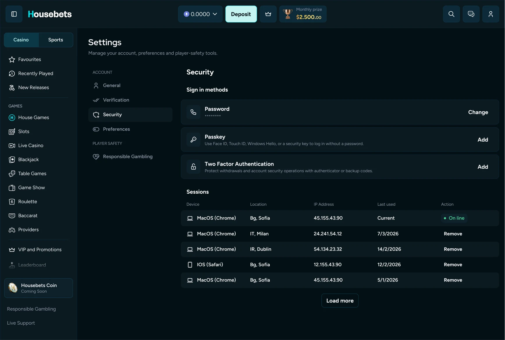
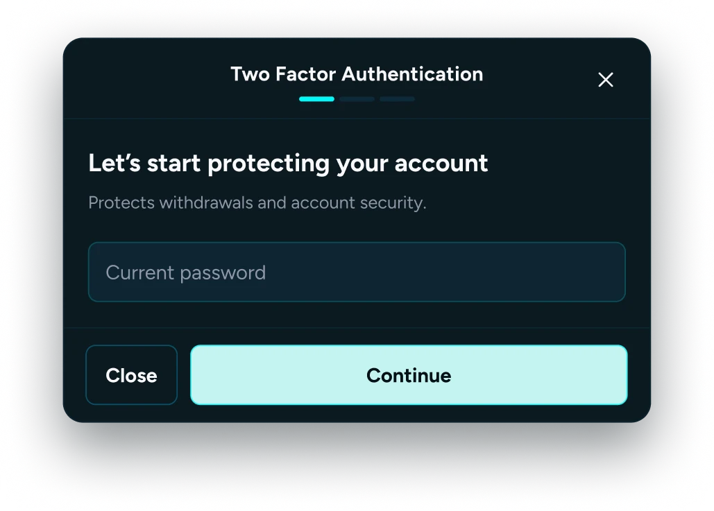
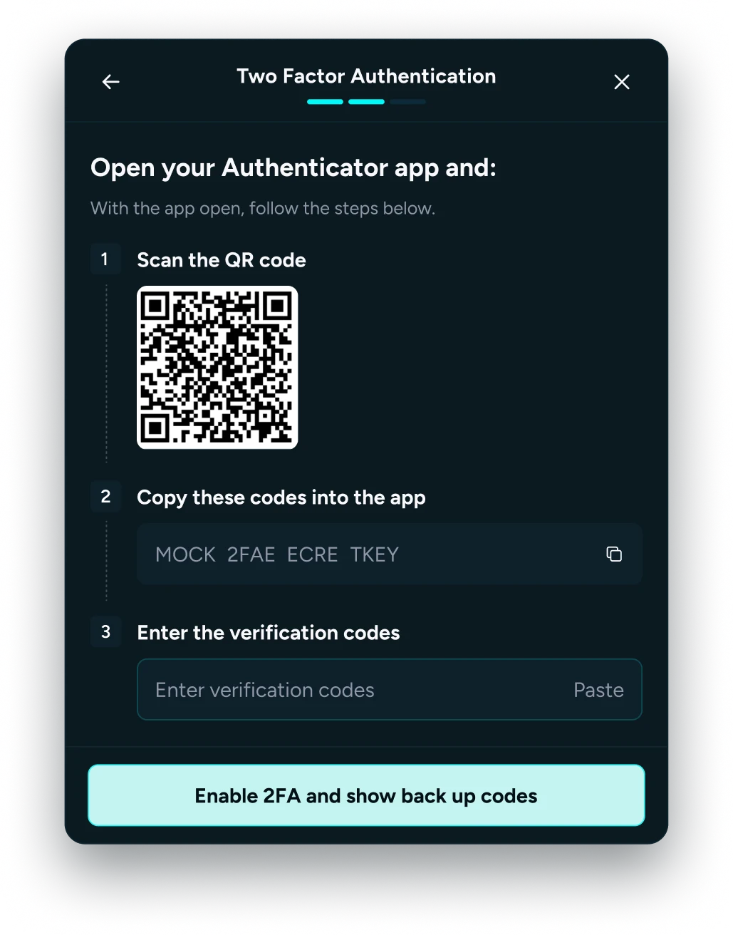
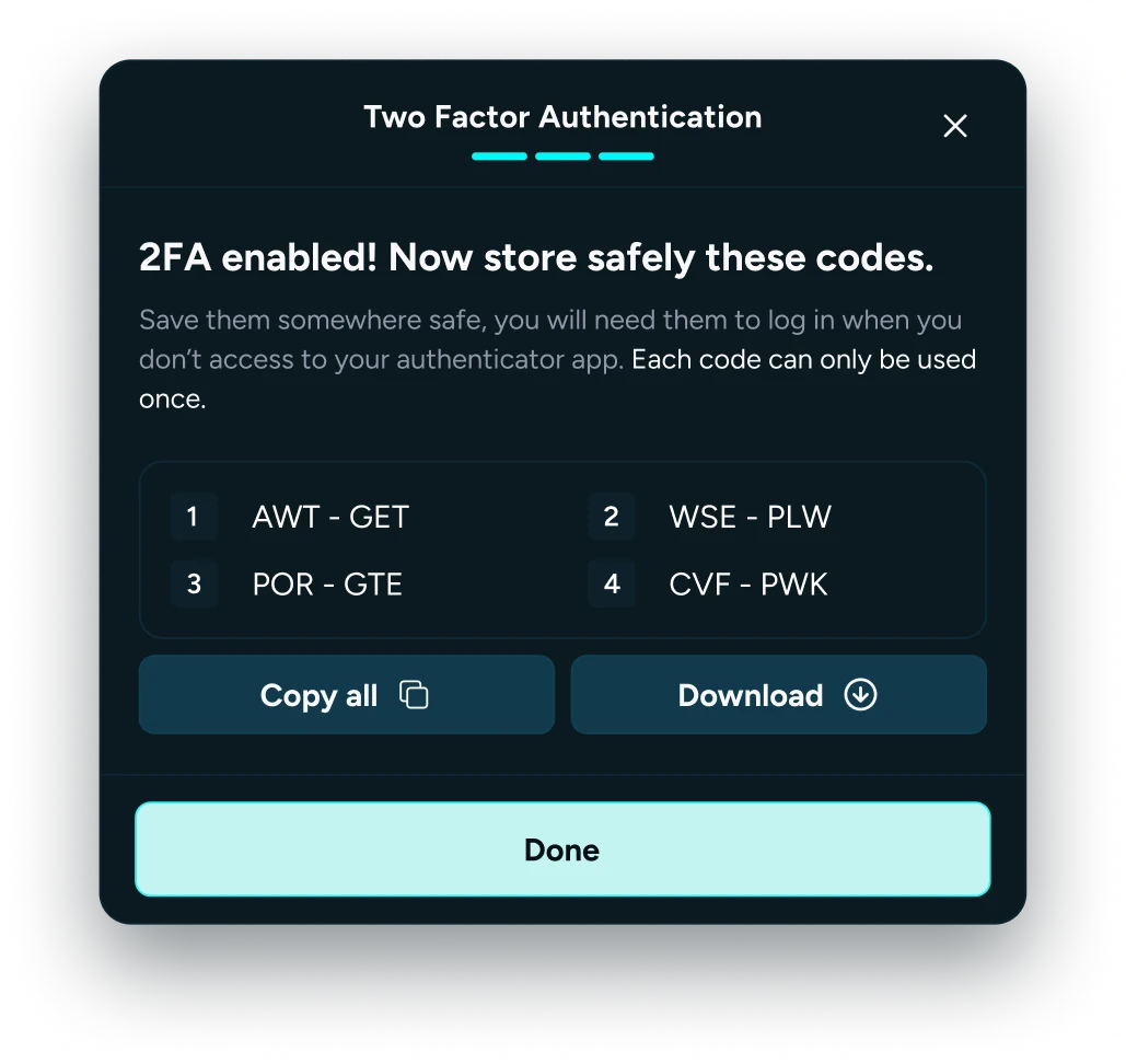
I redesigned and built the settings area, making account details, preferences and security easier to manage.
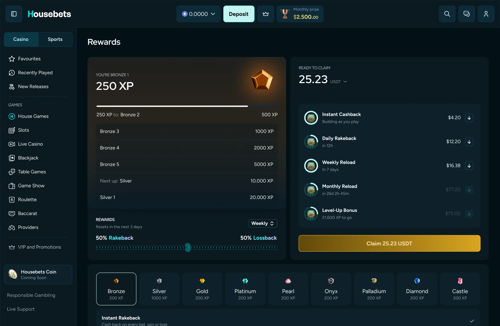
Reward balances and tier progress in one view, with clear next steps.
A guided experience to match an existing VIP status, from entry to confirmation.
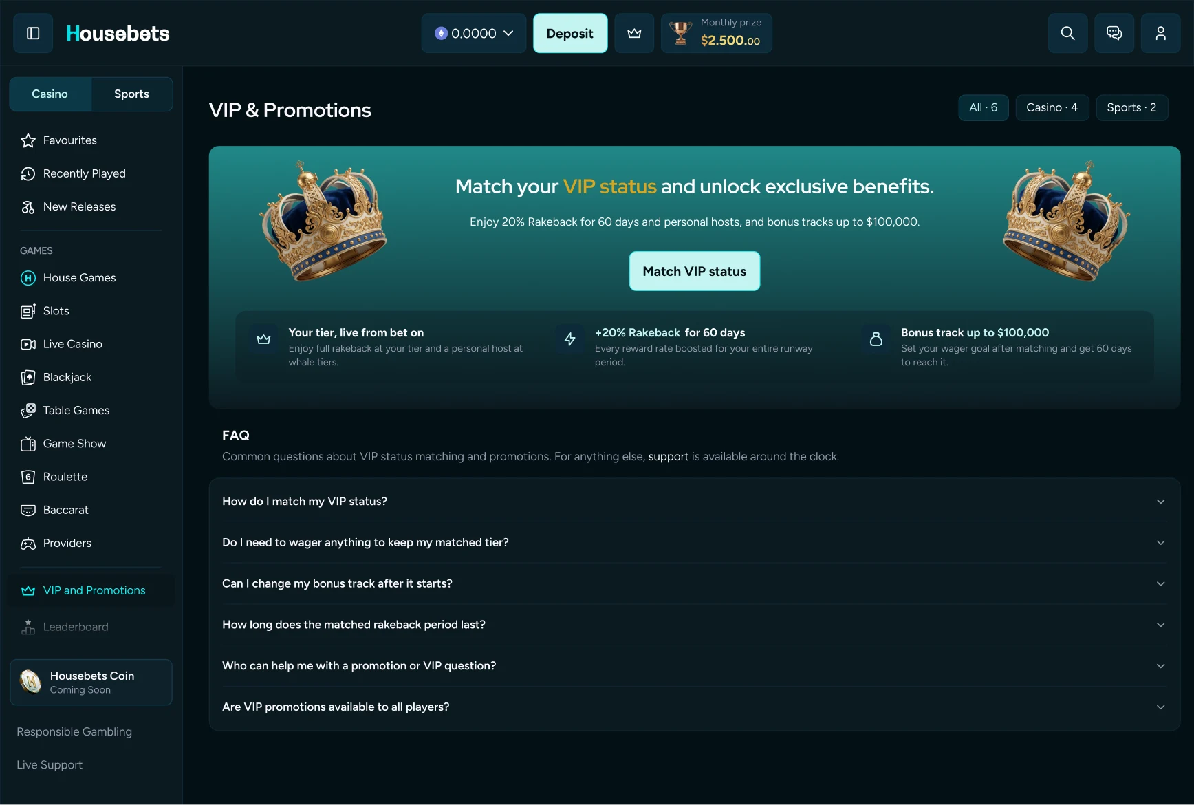
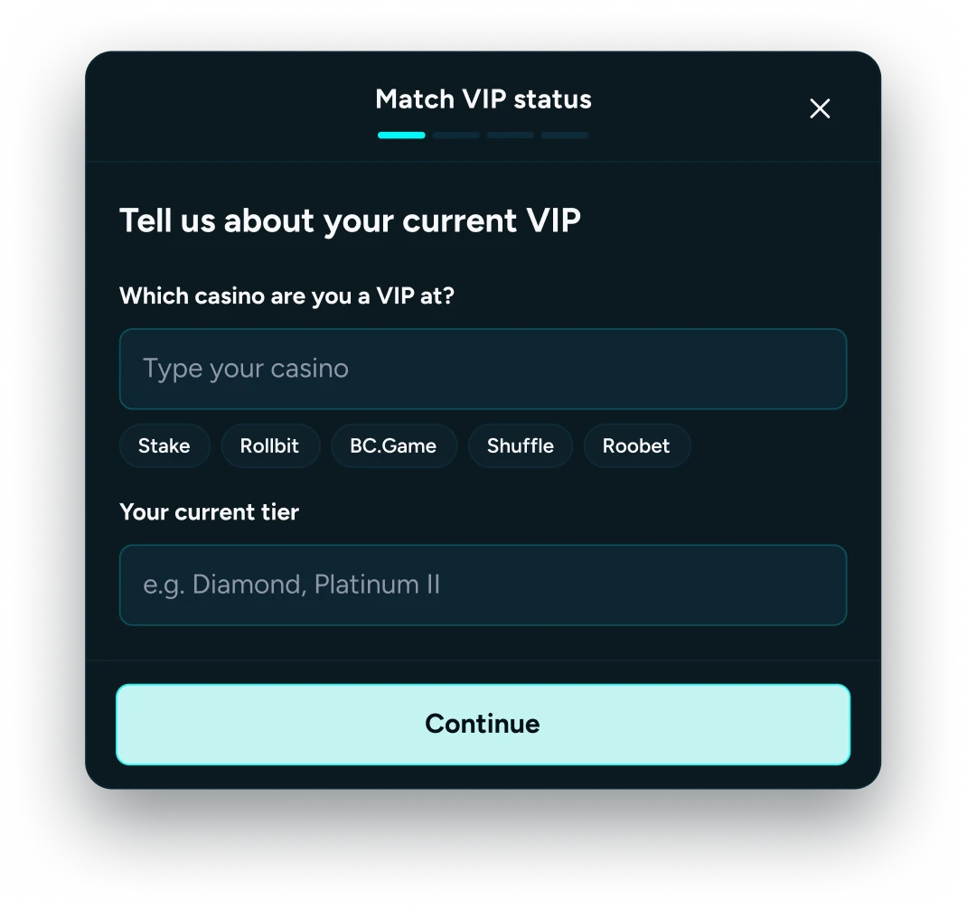
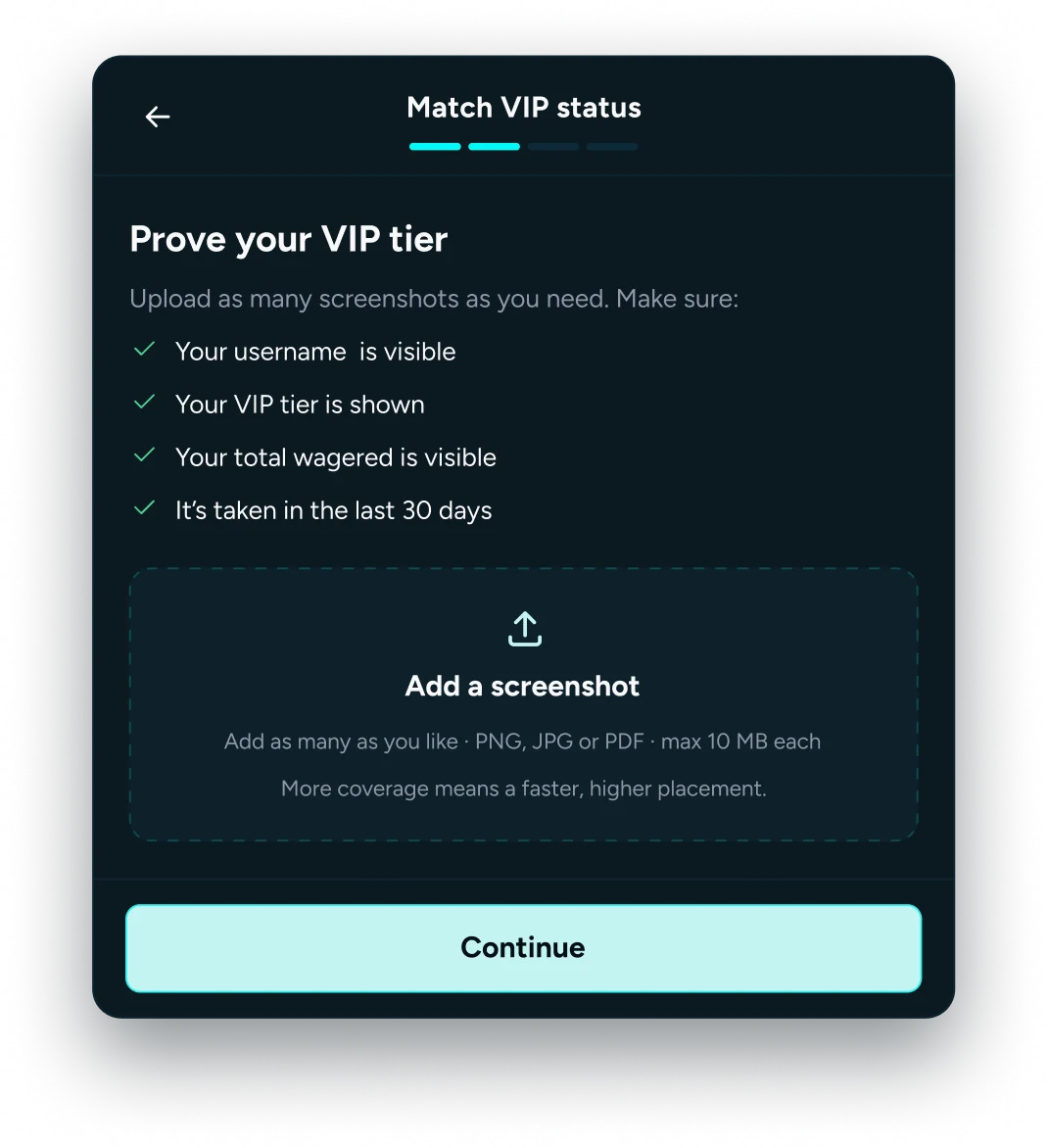
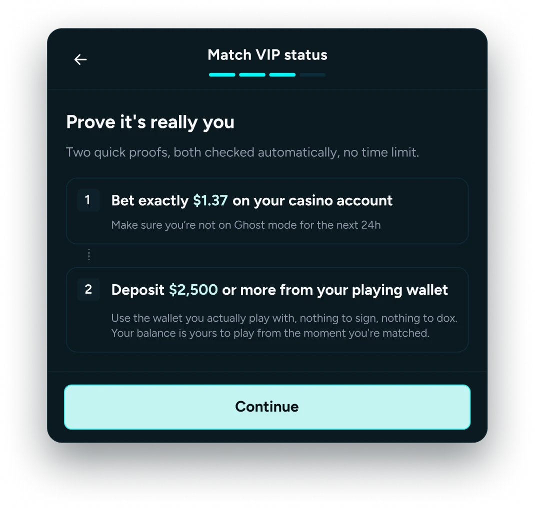
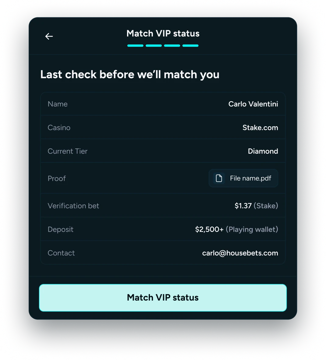
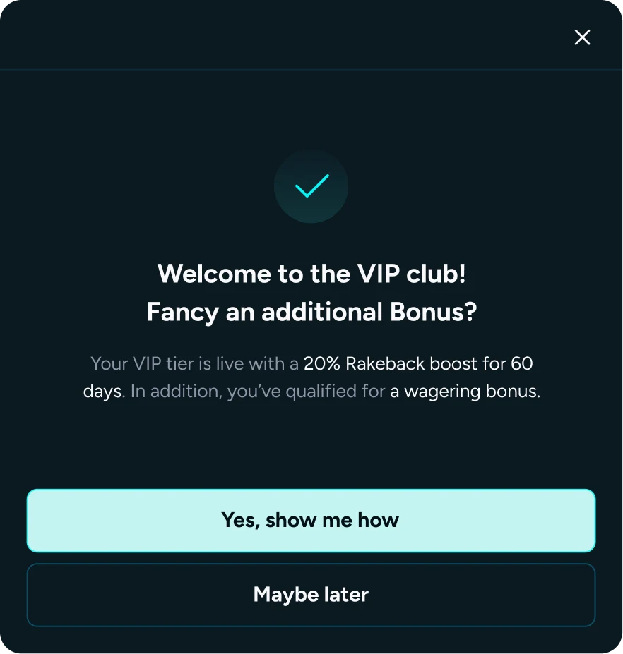
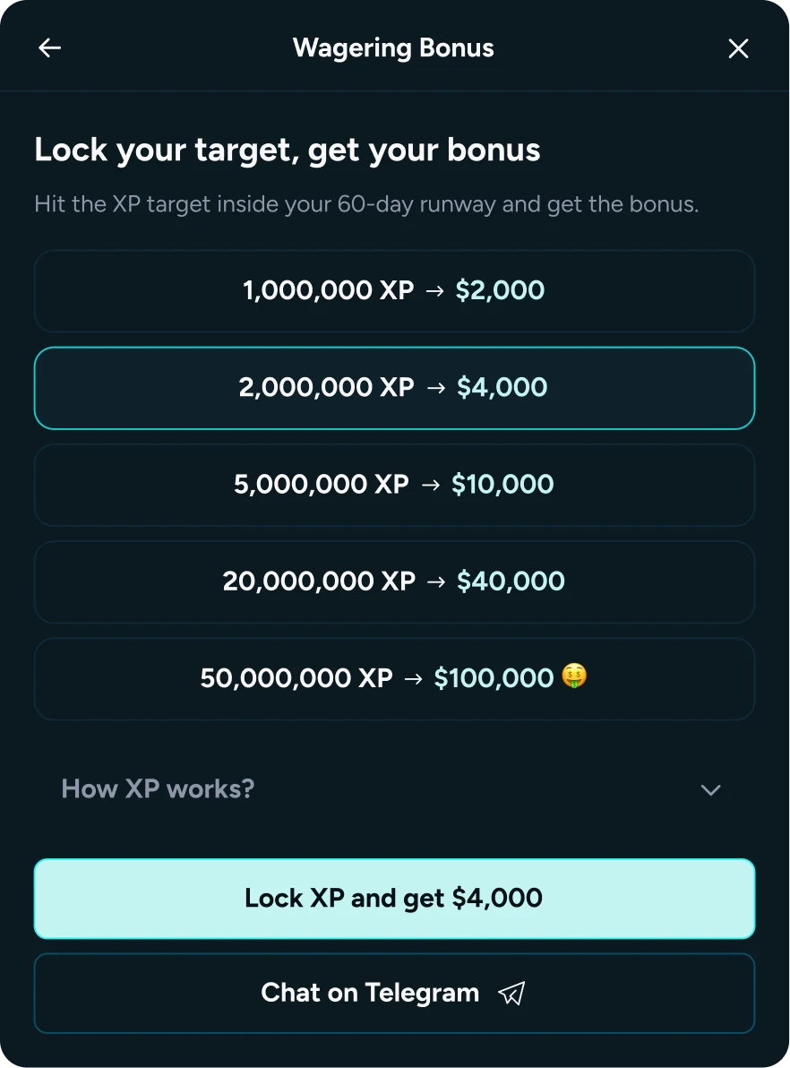
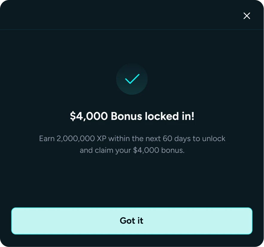
The work also covered wallets, bet details and responsible gambling tools, carrying the same system from Figma into production.
Flooz moved into self-custody with a wallet meant to feel approachable: a cluttered, intimidating category rebuilt around setup, discovery and swapping, without giving up security or trust.
 Flooz
Setup collapsed to two steps with an encrypted cloud backup behind it, so the seed phrase stopped being a wall between someone and their first screen. The recovery warnings stayed blunt on purpose: this is the one thing nobody can undo for you.
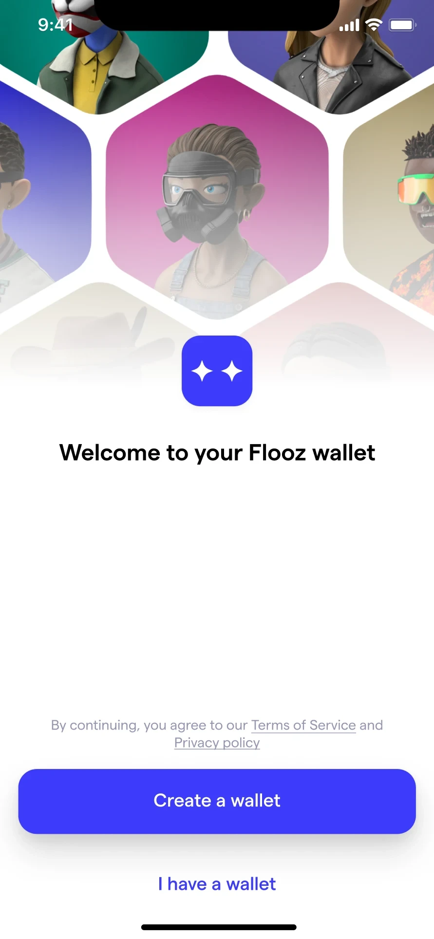
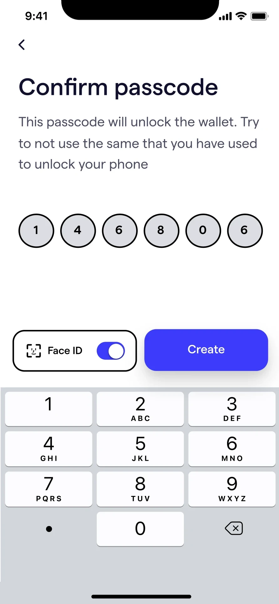
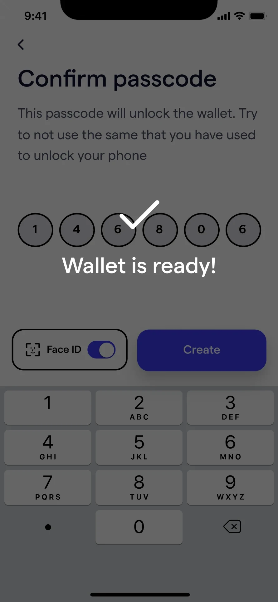
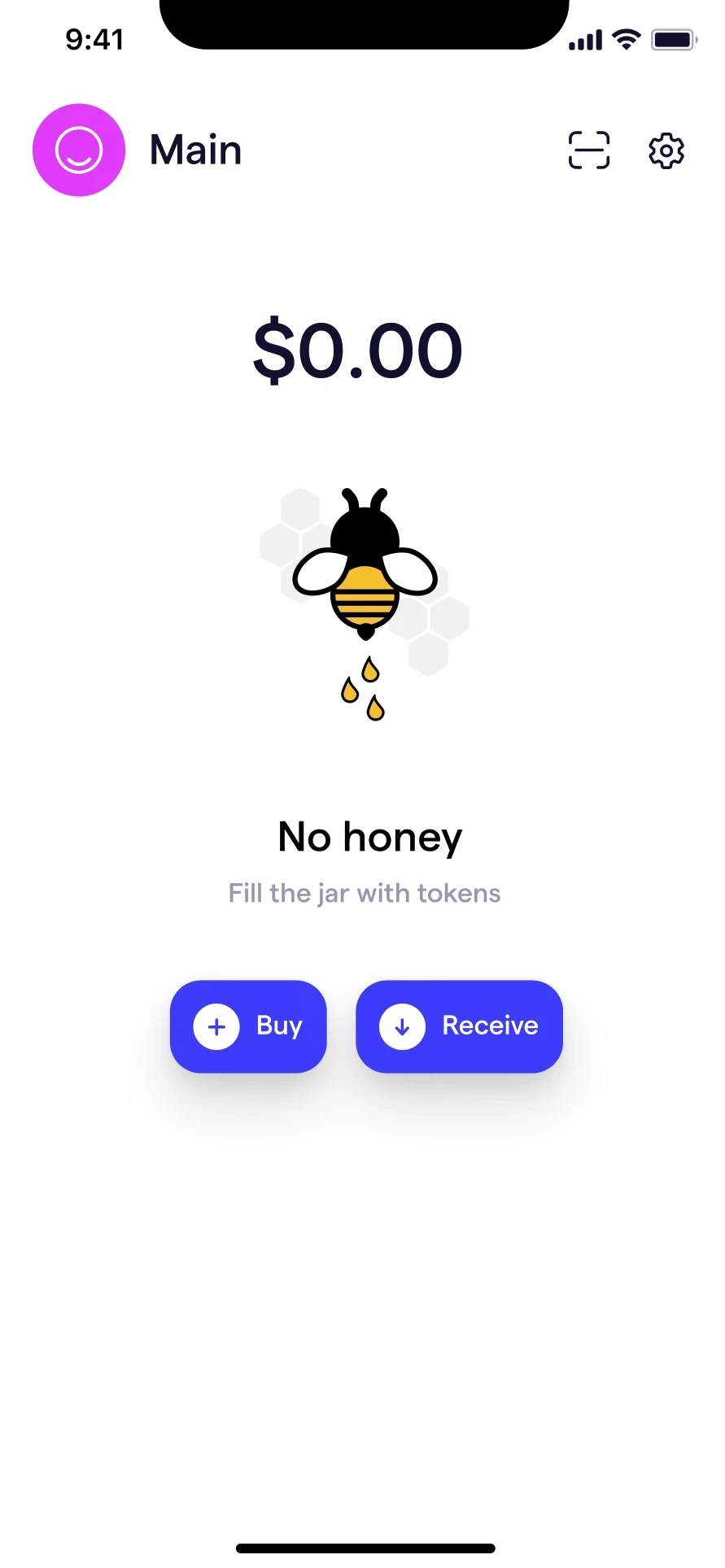
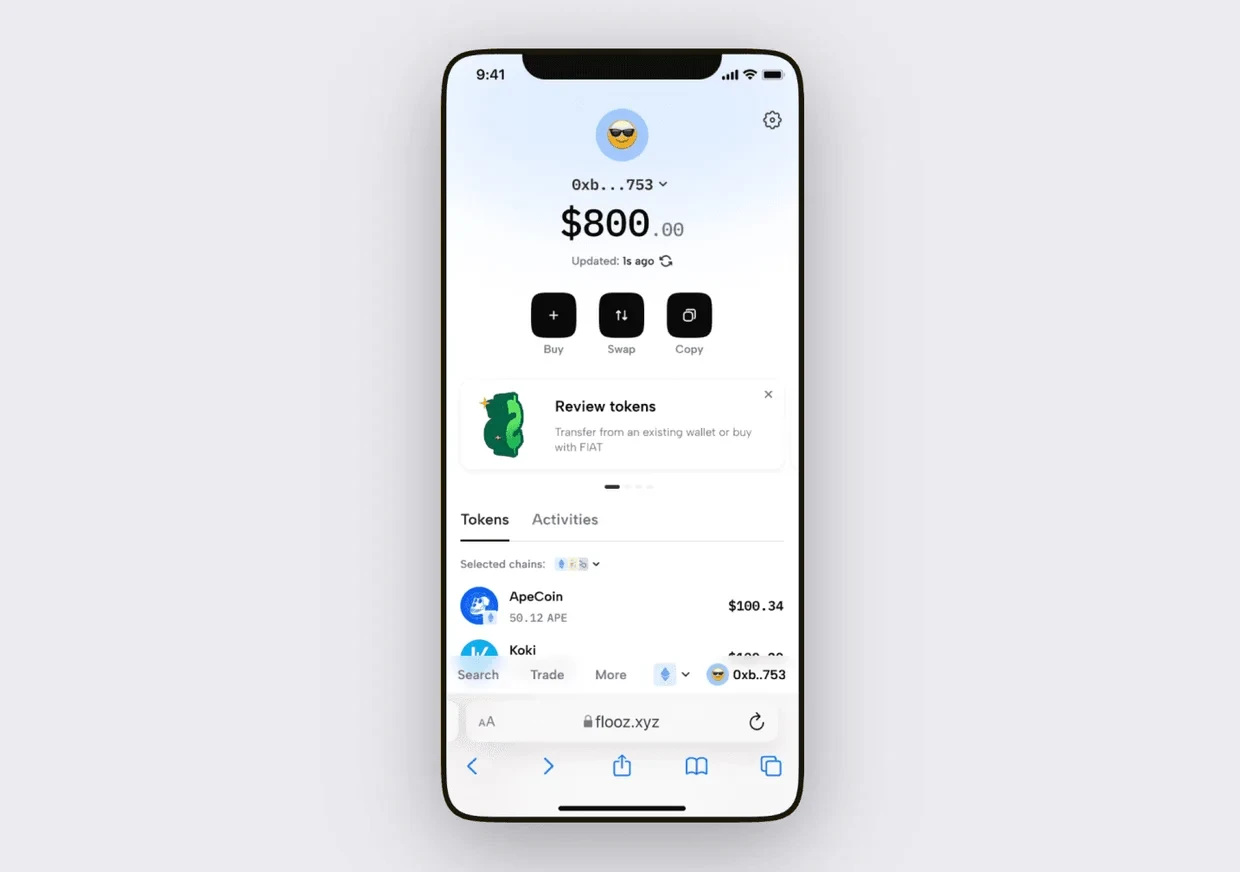
Balance, tokens, NFTs and activity in one view, with buy, send, swap and receive kept in reach rather than buried a level down.
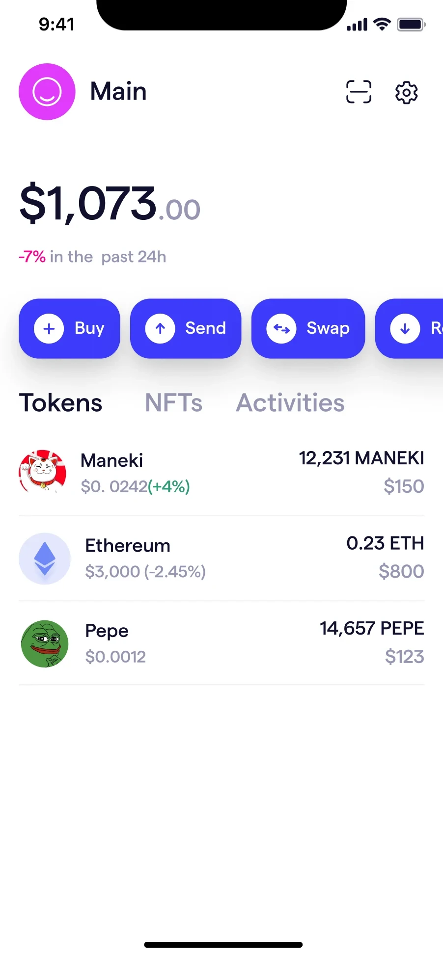
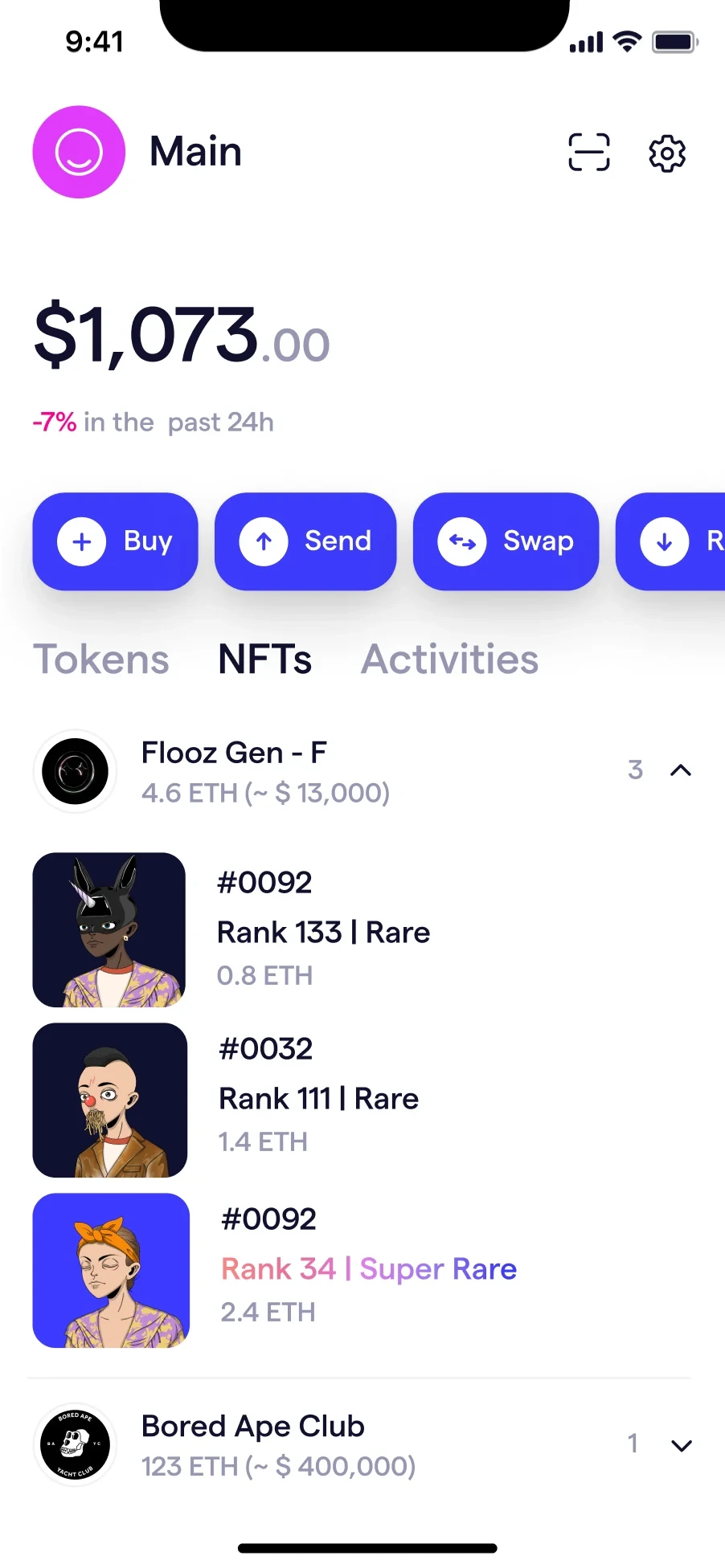
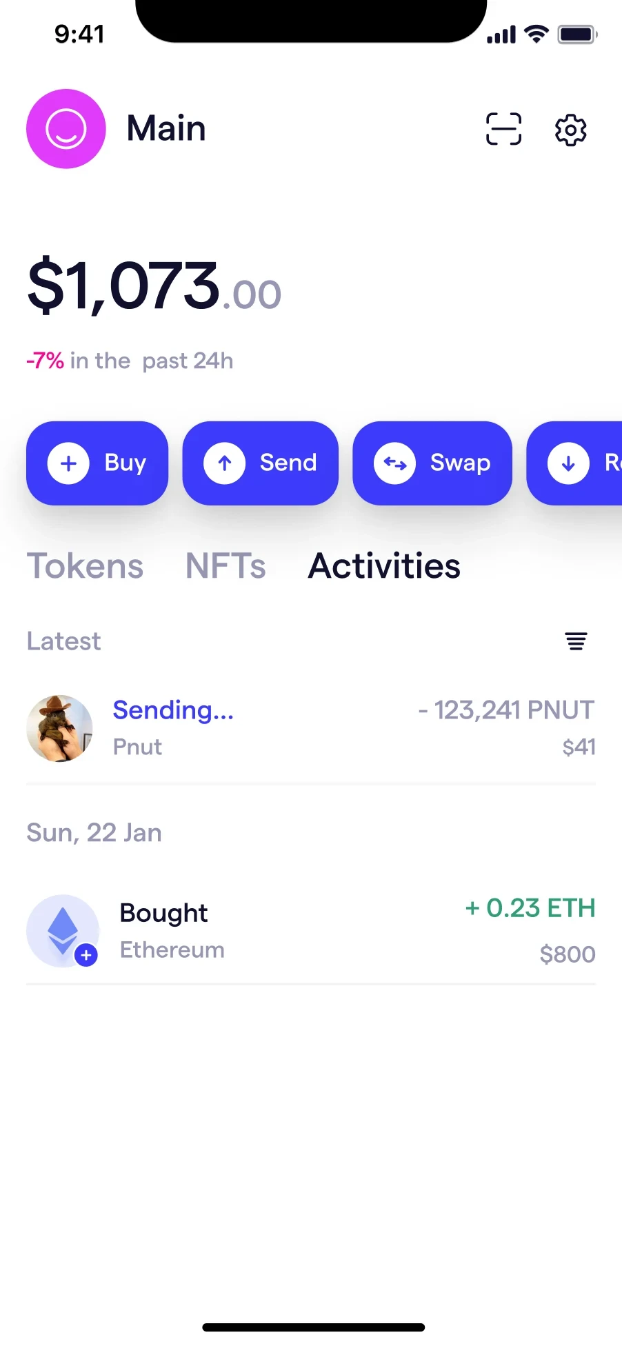
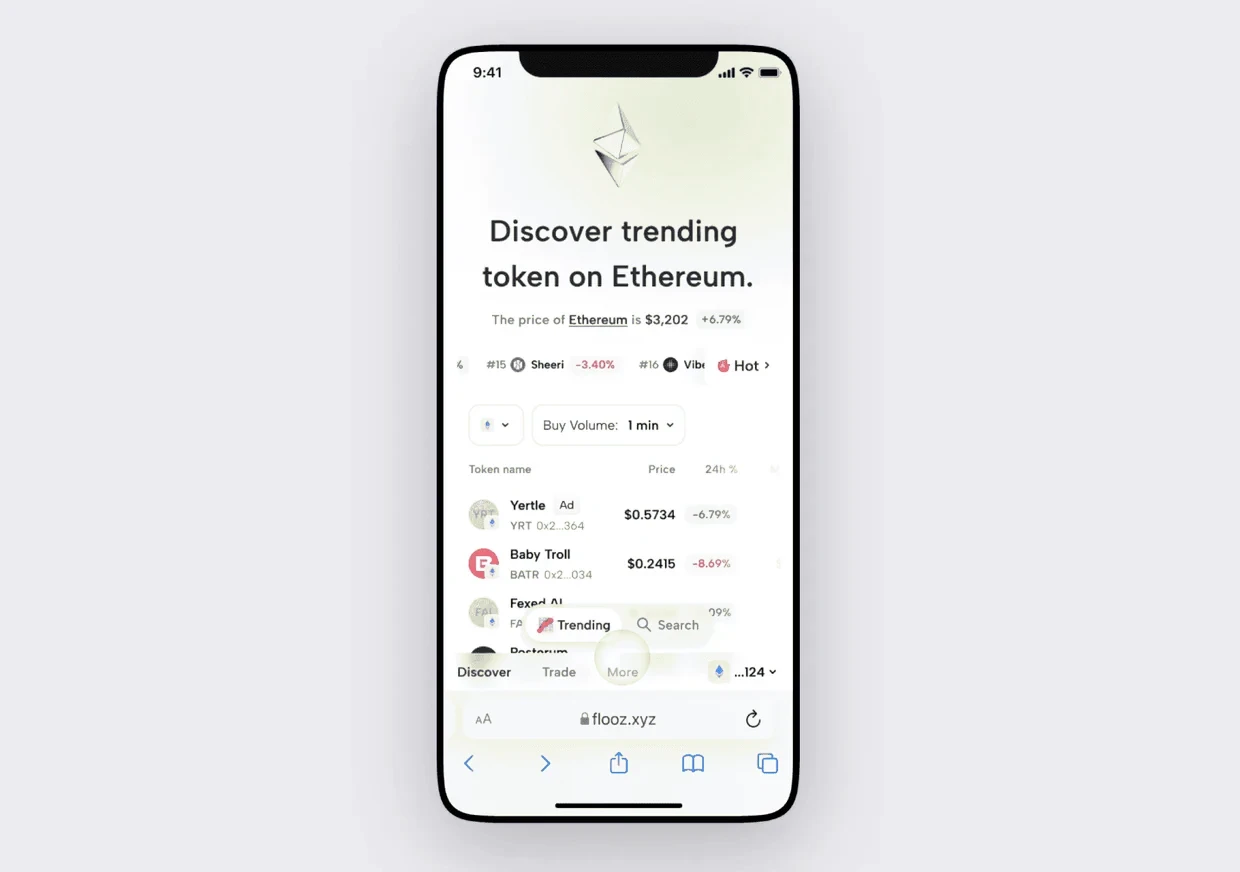
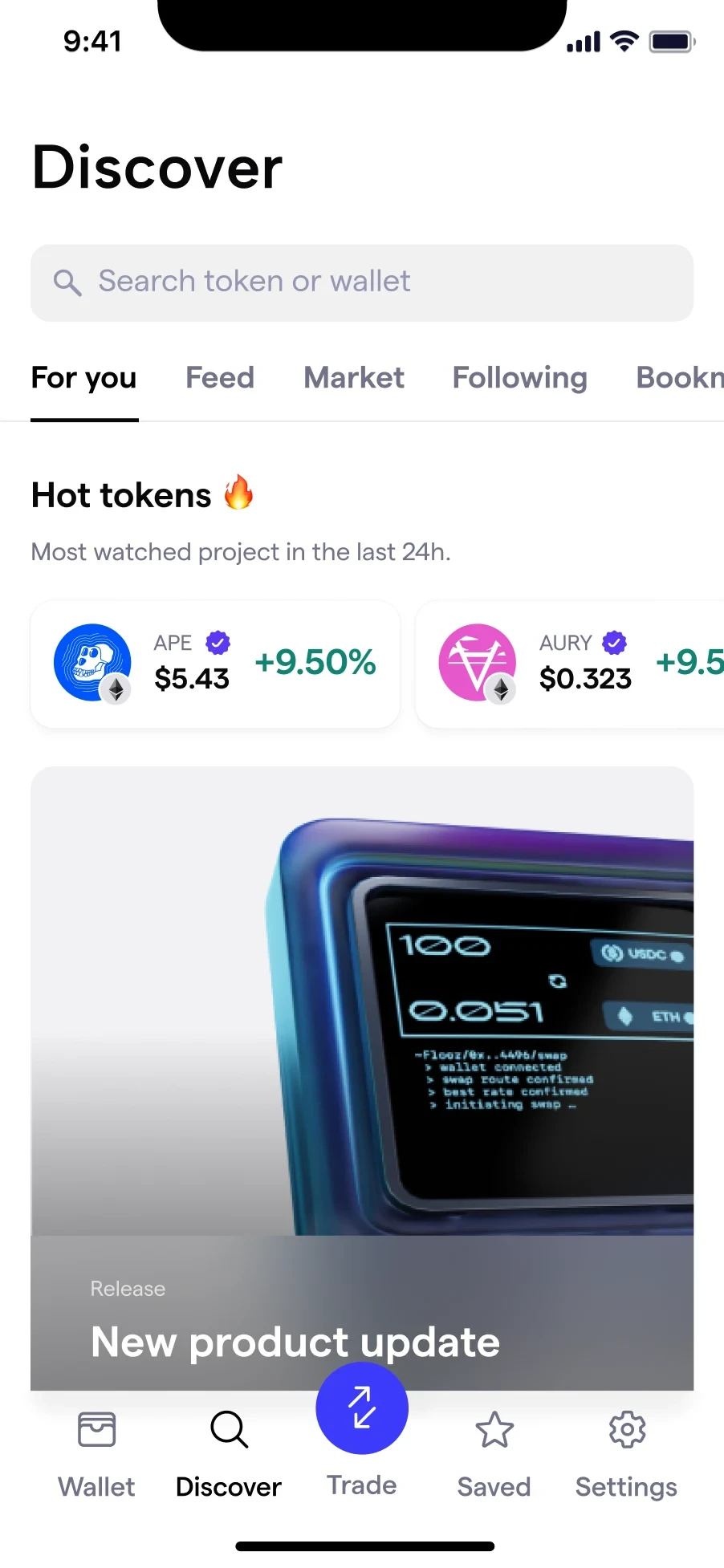
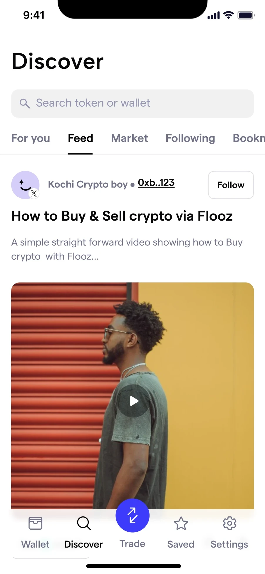
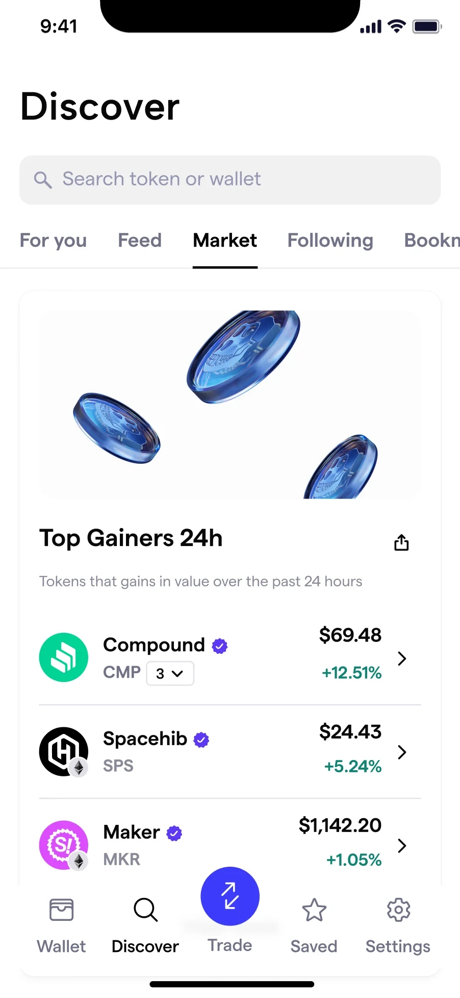
Owning a wallet does not tell anyone what to do with it. Discovery answered the hesitation directly with hot tokens, market movers and a feed, so the next step was suggested rather than left blank.
It was also the riskiest surface. Reviewing it honestly, there was too much to handle on one screen.
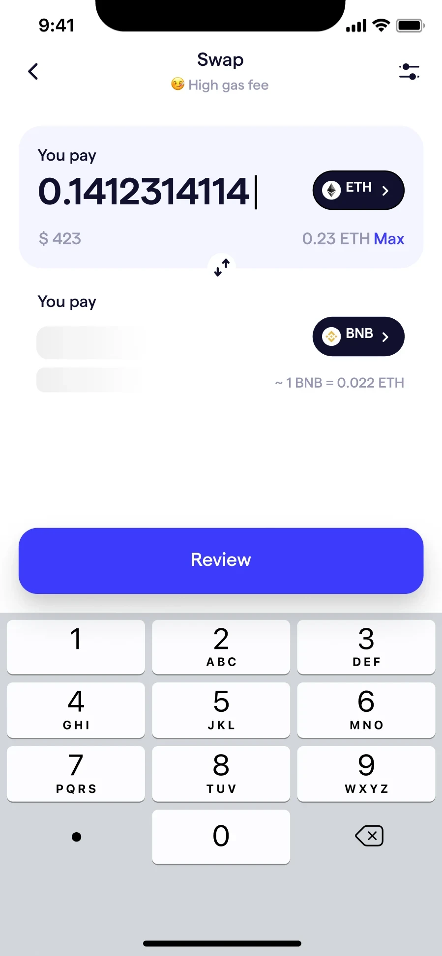
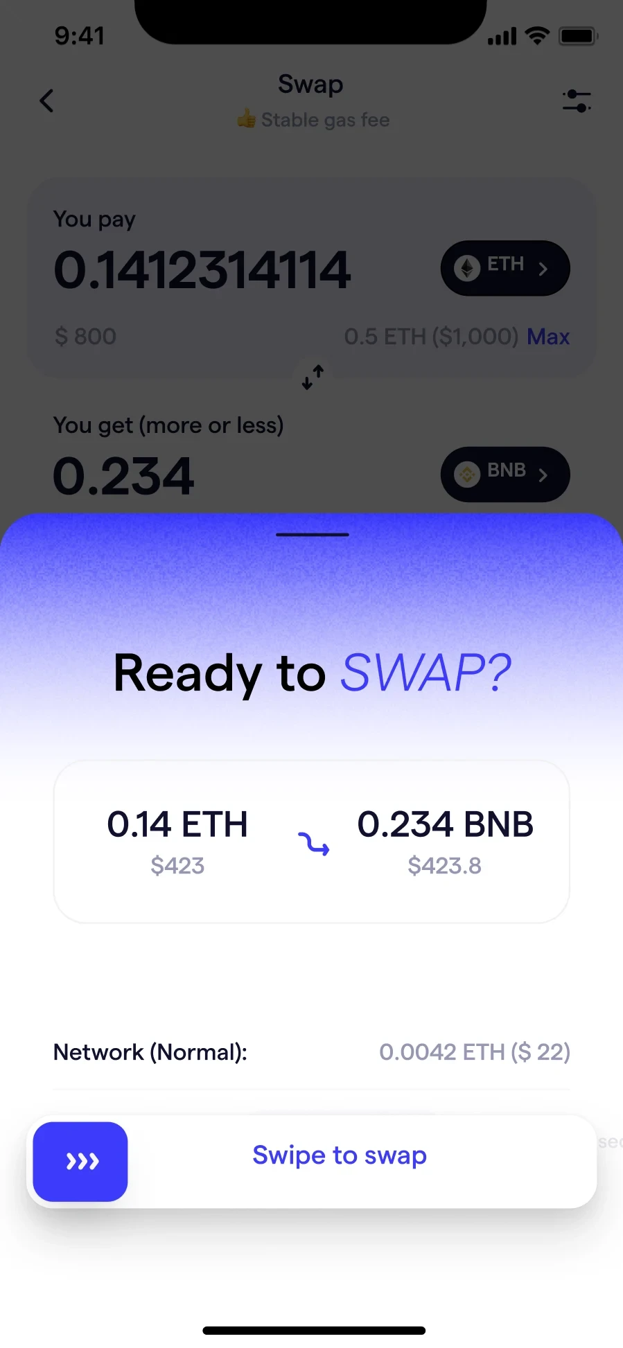
Swapping is where a wallet earns its keep, and where gas fees decide whether a trade is worth making. The fee became a plain-language state, low, stable or high, shown before the review step rather than as a number to decode after it.
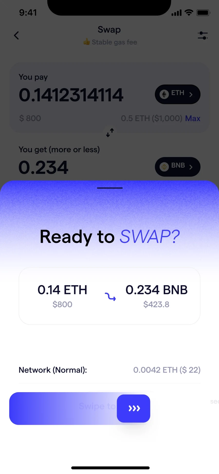
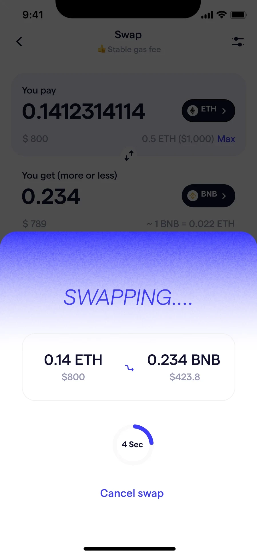
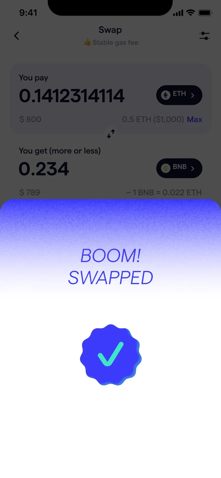
367 wallets were created in three months and daily active users settled around 1,000, but the wallet generated under 5% of all trading on Flooz. There was a surge in sign-ups and then a failure to keep those people engaged. The product was later deprecated.
Focus, and optimise the core features rather than widening the surface. Discovery competed with the wallet instead of supporting it. Leaning on the community Flooz already had would have done more than another screen.
The honest constraints were context switching across a small team, building while the product was still moving underneath us, and settling for good enough in places where it mattered.
I designed a connected buying journey for tokens unavailable through direct purchase, bringing the quote, provider choice and subsequent swap into one flow.
FloozBuying an altcoin could mean purchasing a native token first, waiting, then starting a separate swap. That fragmented journey was especially confusing for less experienced traders.
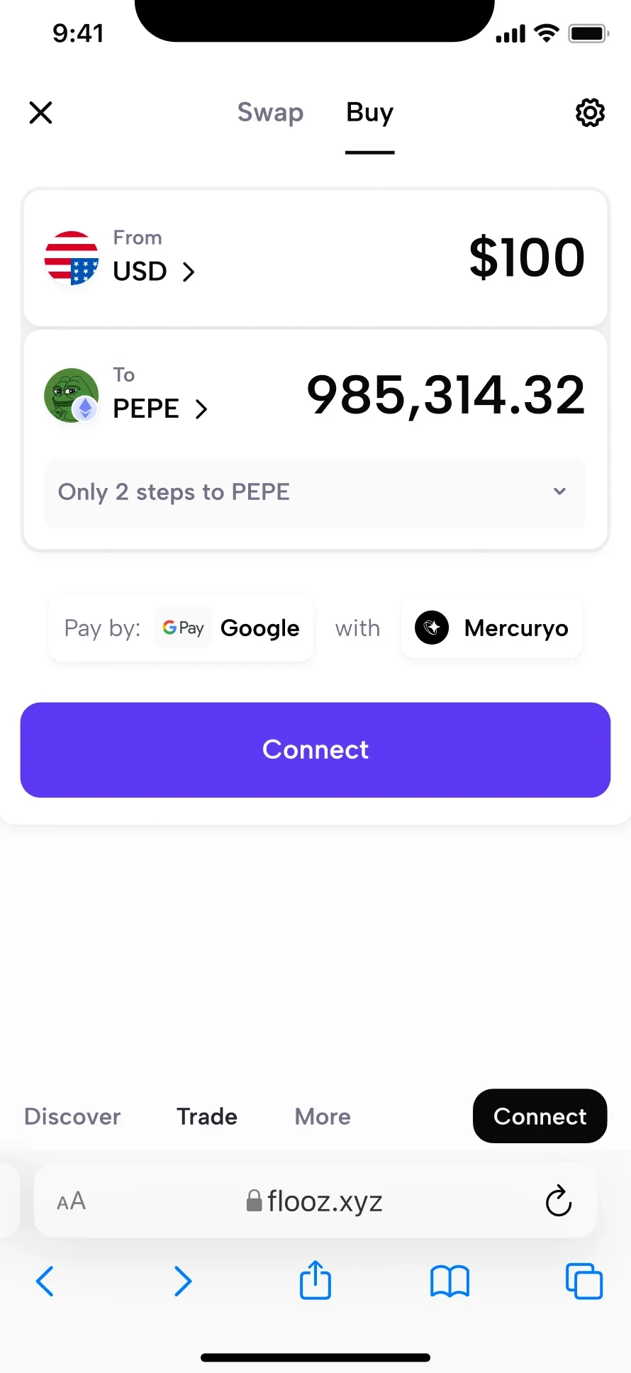
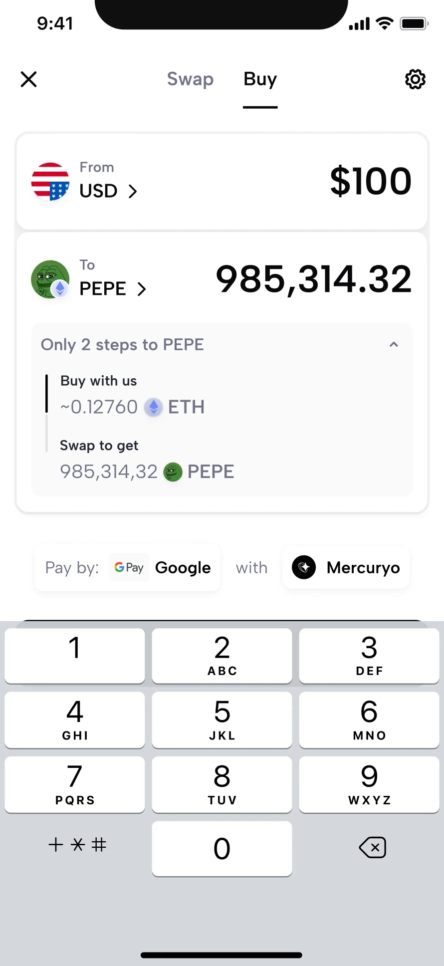
Shifting requirements, short delivery cycles and limited data shaped the work. Small partner tests helped clarify how unsupported-token purchases were explained.
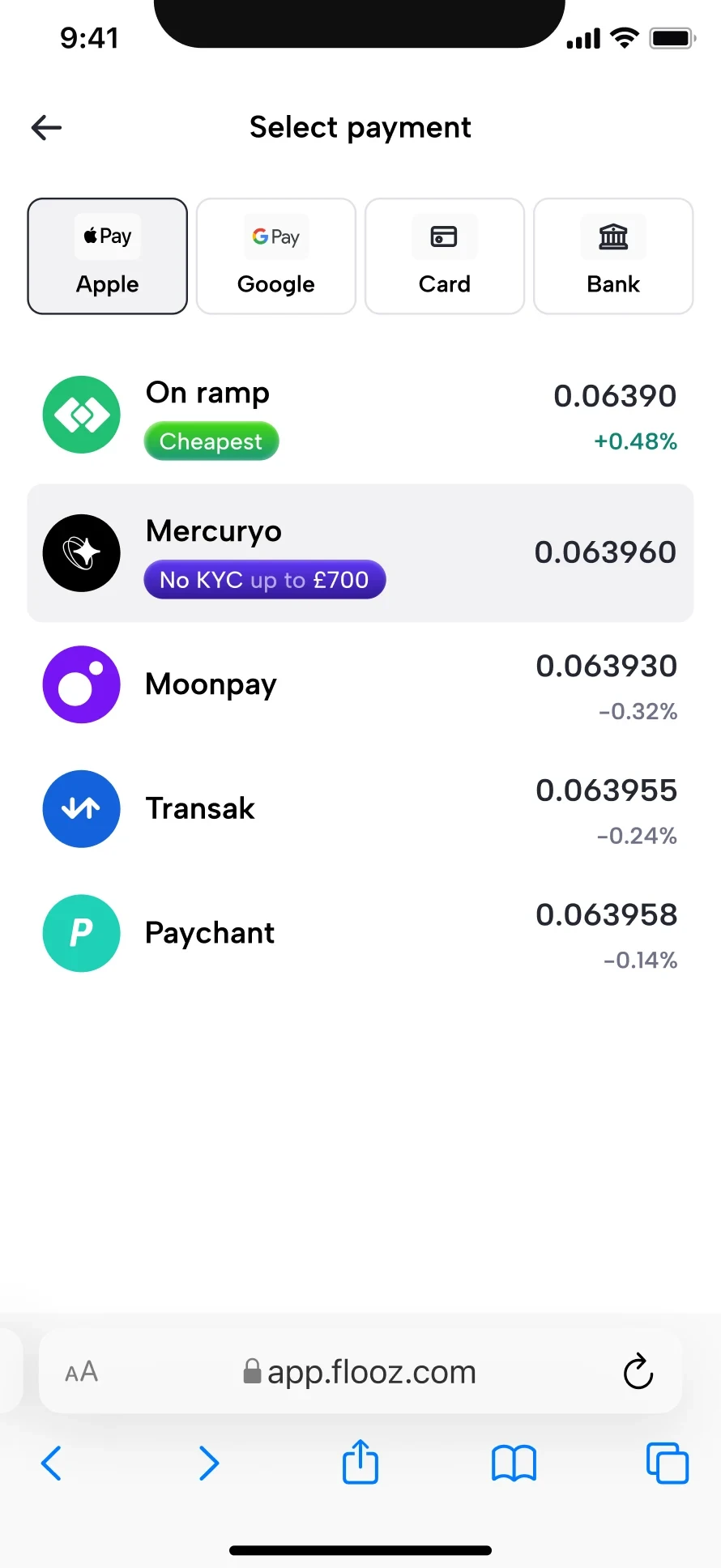
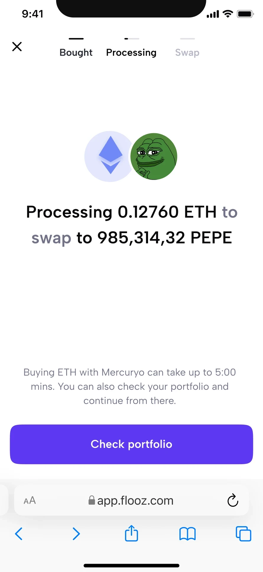
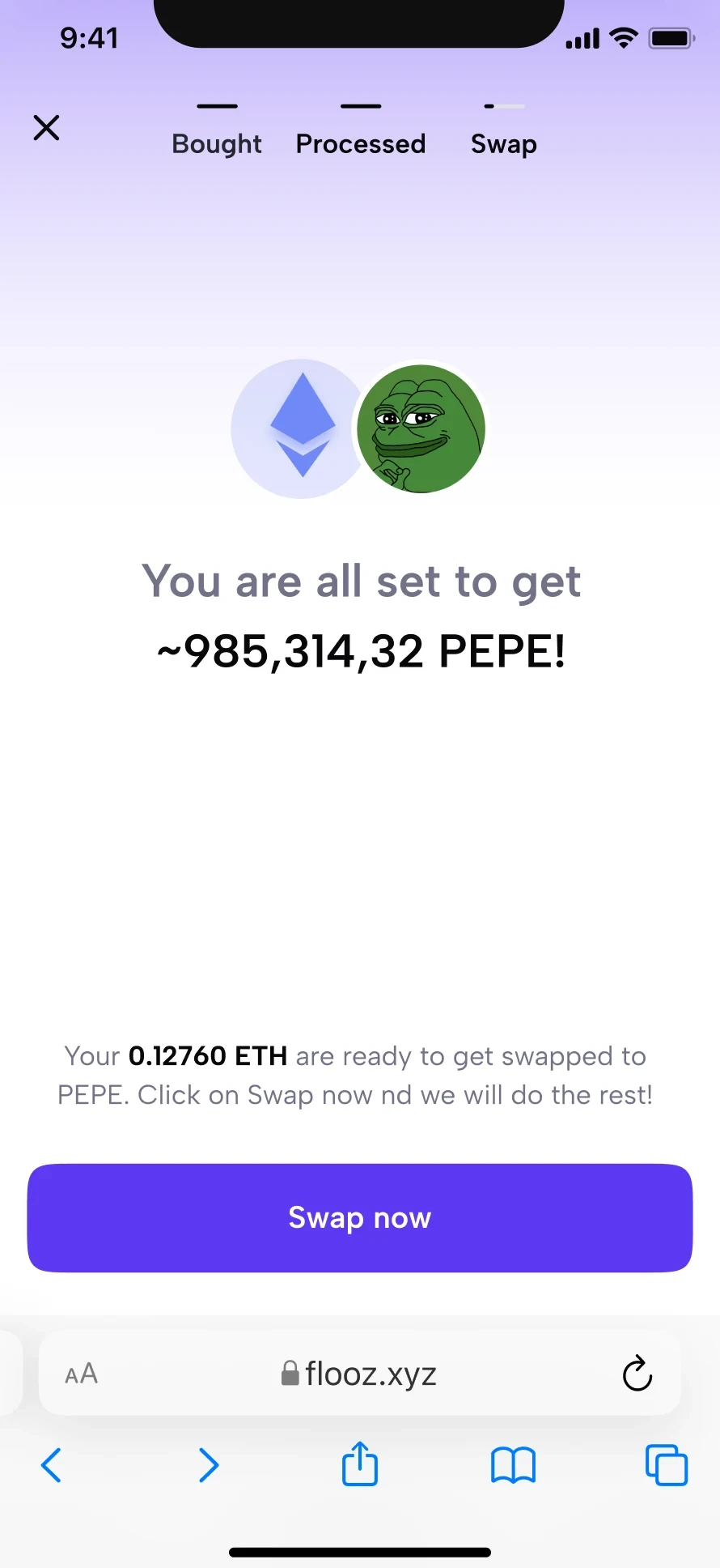
Adoption grew after launch, but conversion declined and trading-revenue impact stayed small. Remaining steps and low fees limited the business outcome.
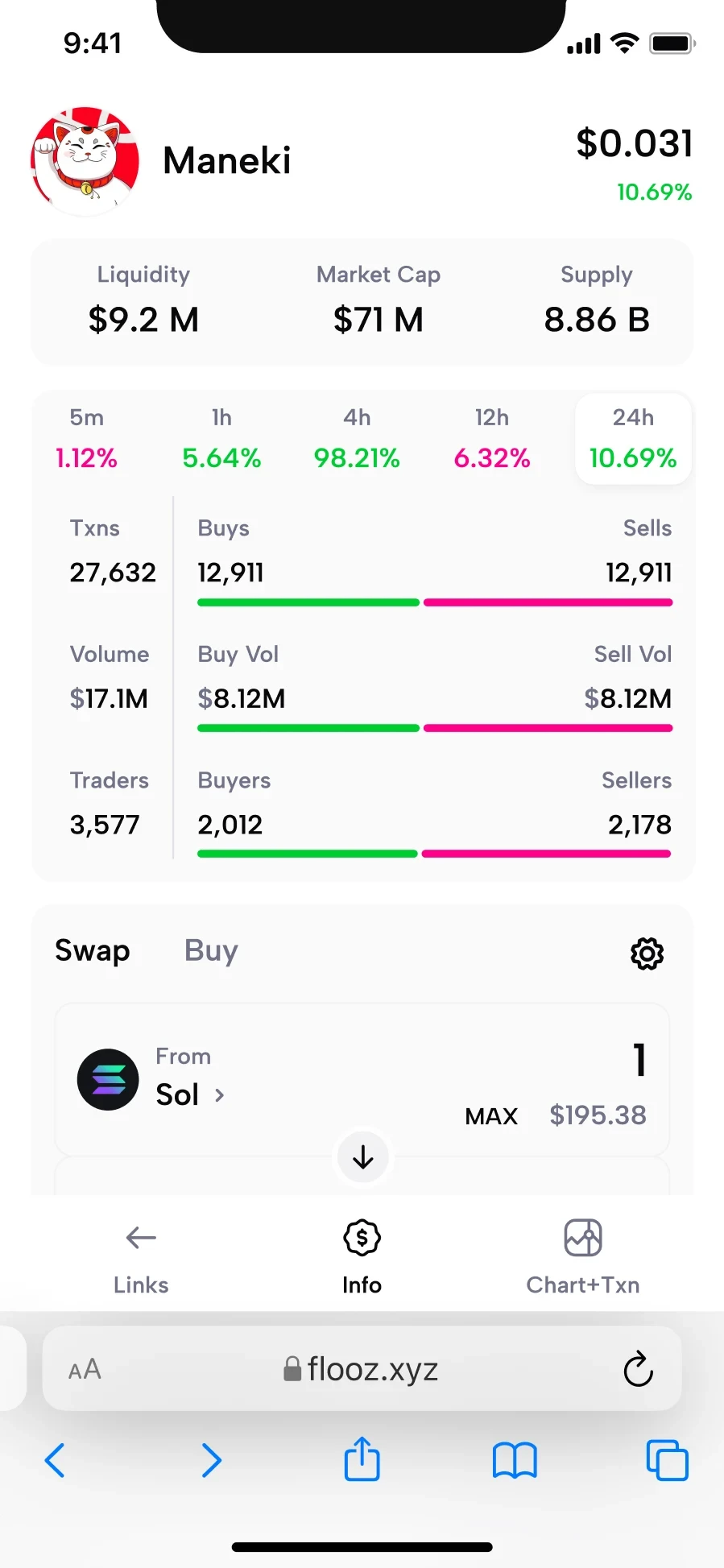
Simplifying Flooz discovery, search and wallet access so the most useful information has room to breathe.
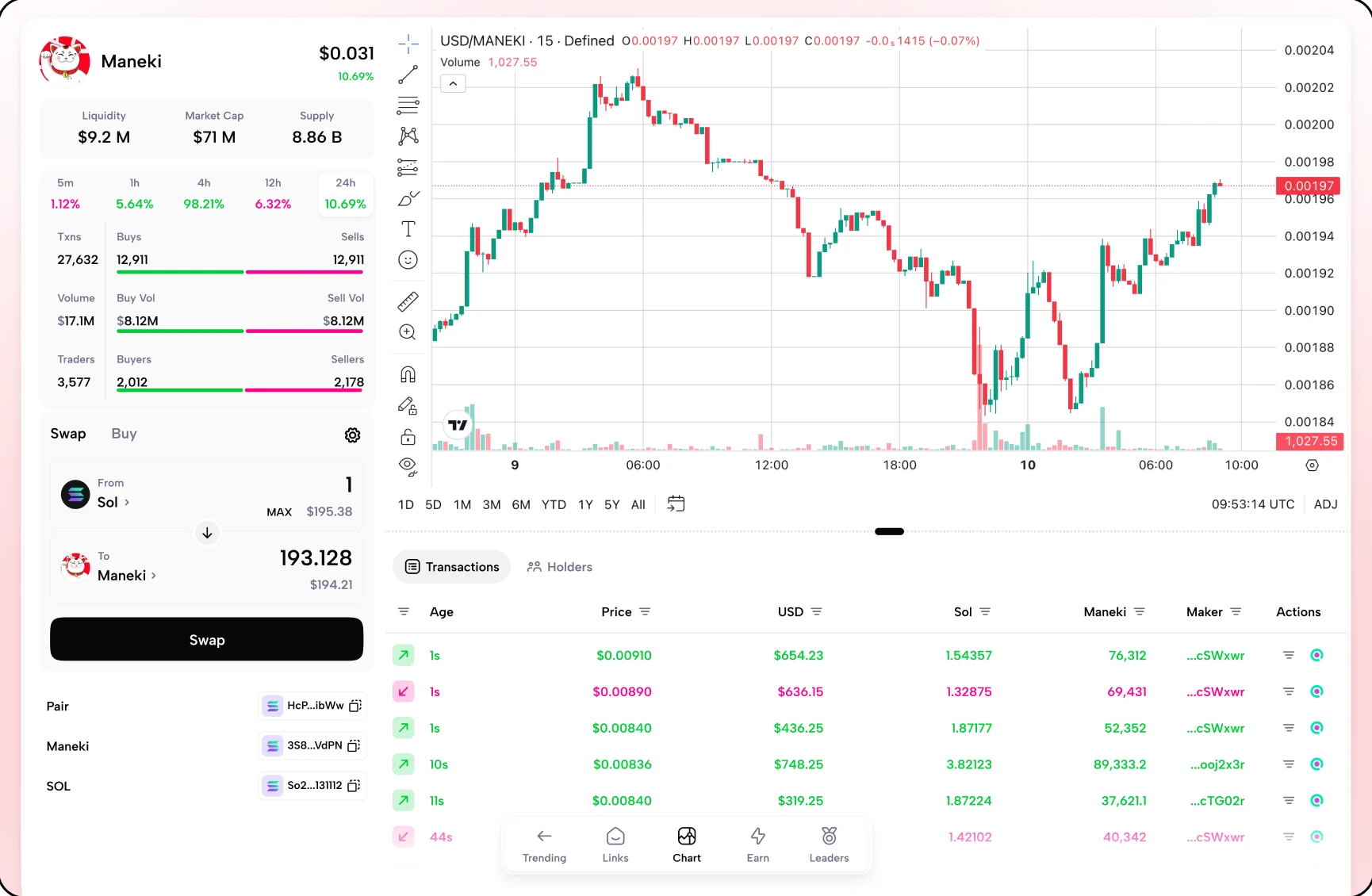
FloozA simpler landing page defaults to trending tokens, with more space for data and categories supported by the Defined API.
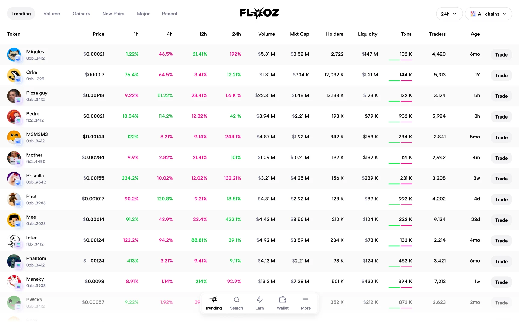
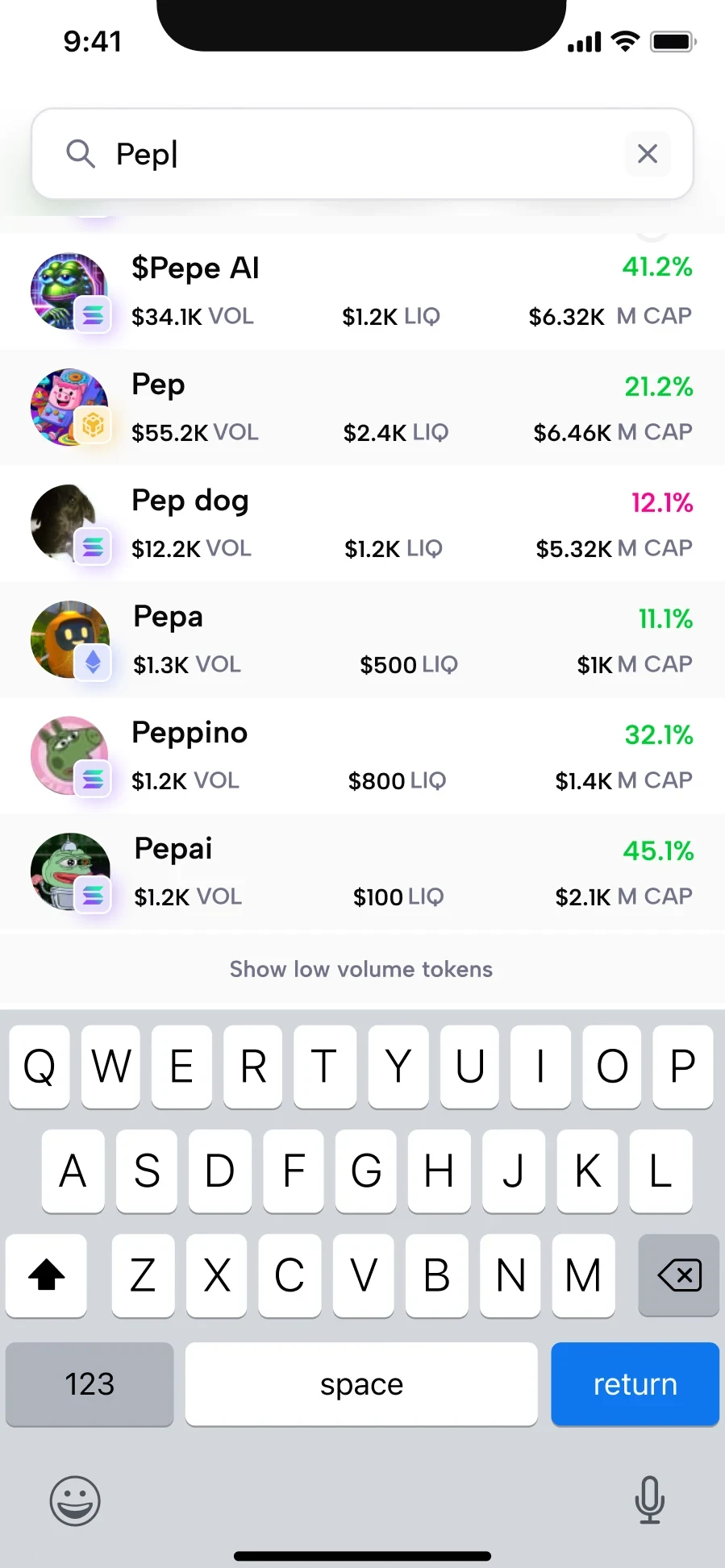
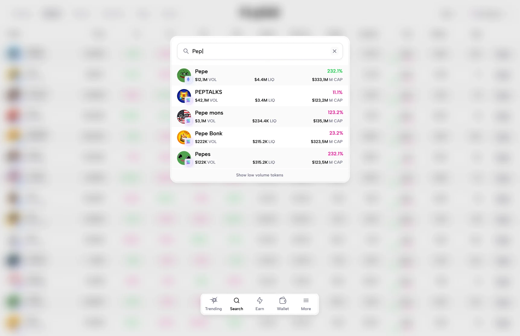
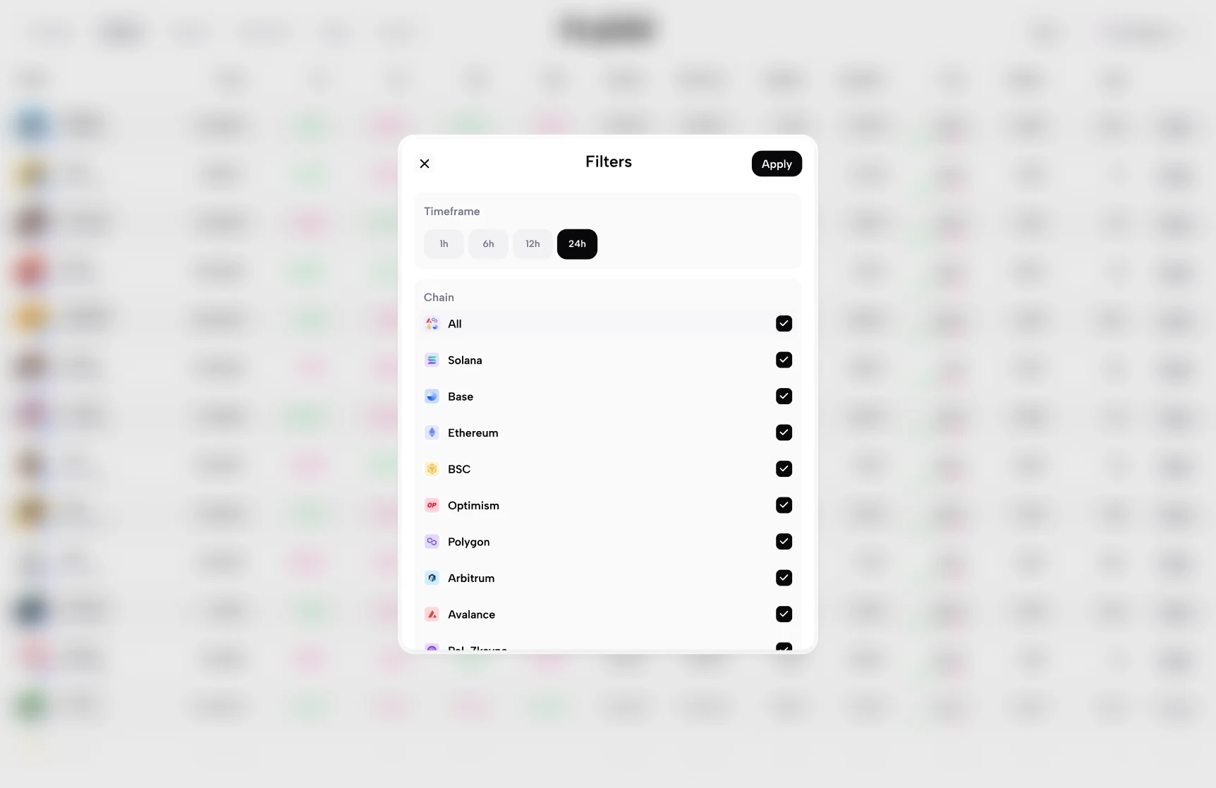
Unused advanced filters were removed in favor of a direct search experience.
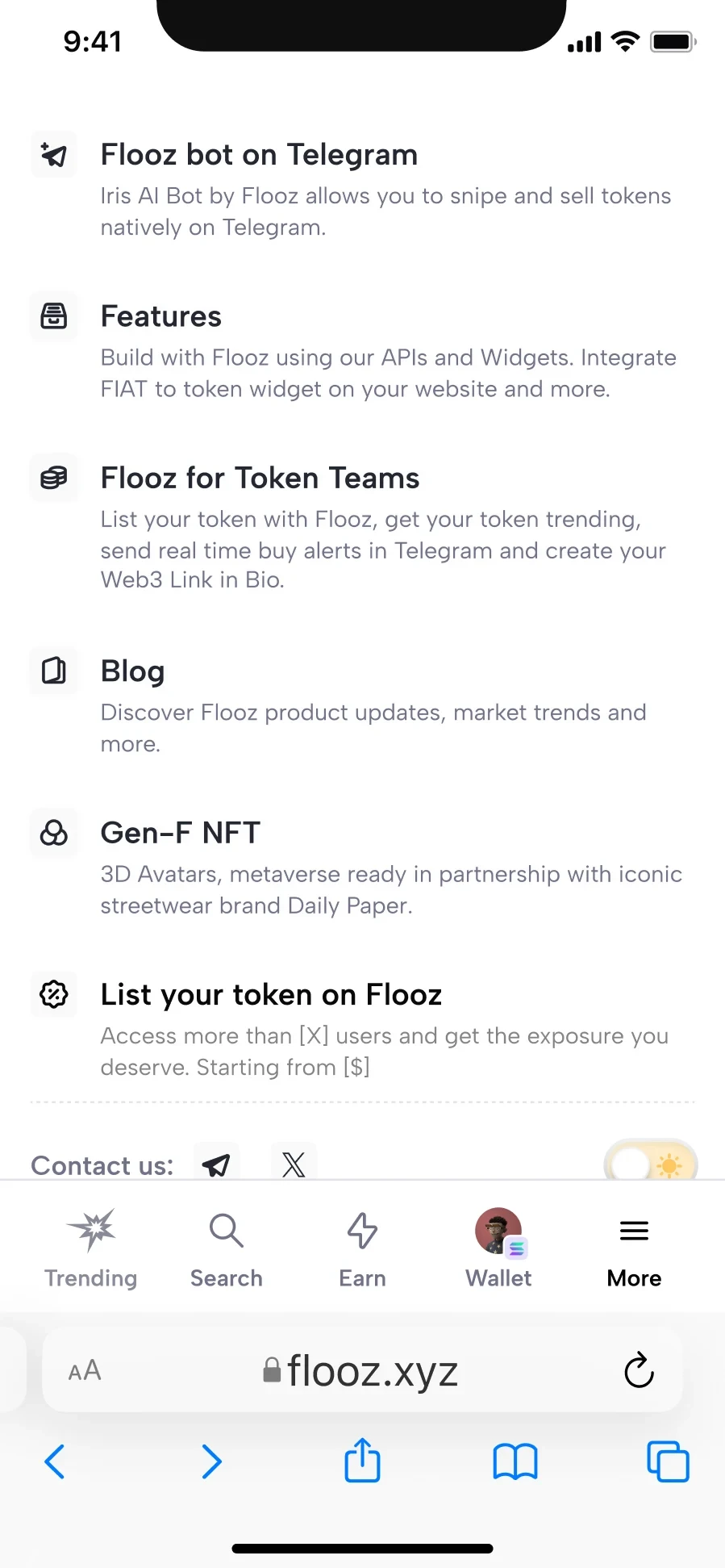
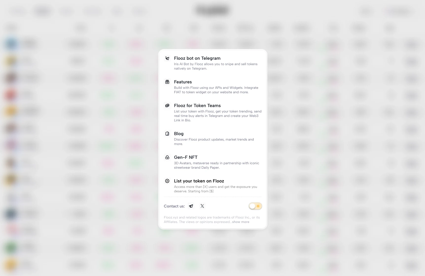
Secondary links were brought together in one compact place.
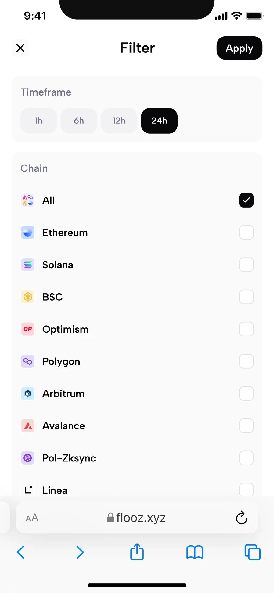
The first version kept filtering focused on two options.
Reorganized content gives charts and transactions more room.