Sole Designer
2 Months
Web
Streamline navigation
Get in touch
Case study coming soon...
TL;DR
Trending
We restructures the landing page, removing unnecessary complexity. Set on trending by default we leverage the Defined API to create more category. Space also has increase giving to the user a better overview of the different data points.

Search
We remove the advanced filter as the feature was not used. User are likely to have with a clear search criteria in mind rather than with a discovery mindset. The view is straightforward and gives you what's expected from a simple search.

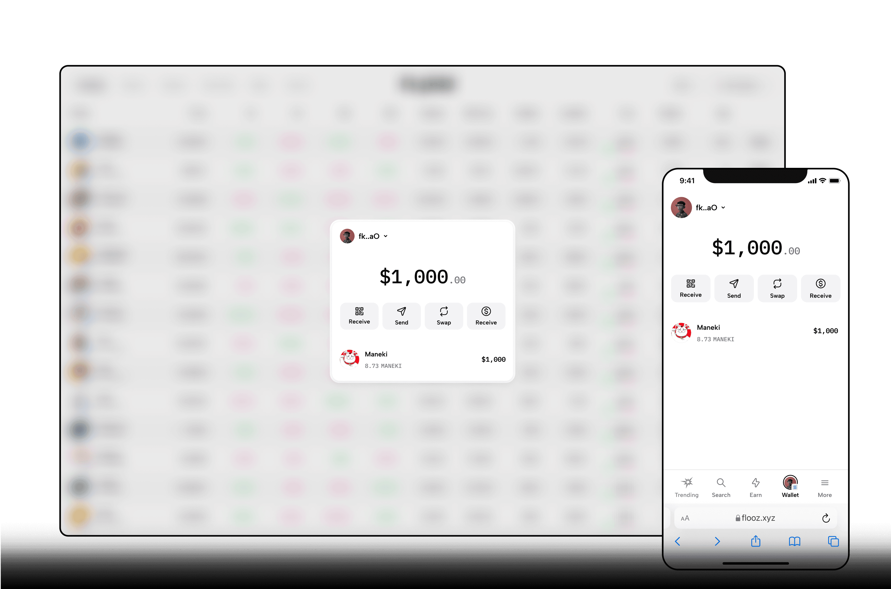
Wallet
We moved the wallet to the main navigation so it's present anywhere you are on the app. A simplified view where you see holdings and actions. No more activities as where not really working as expected.
More
Here lays a repository of secondary links, accessible and compact.

Filters
For the first version, we left the filtering to be as efficient as possible by giving to the user two options.

Token page
The tokens pages are getting a major uplift. We moved things around a bit giving to the end user a much more real estate to see what's matter, chart and transactions.
